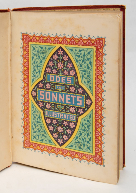
This visual study is dedicated to the title page and title spread of a printed book. I examine their historical development, changes in composition, typographic hierarchy, and the interaction between text and image, as well as the formation of visual conventions for presenting the book to the reader.
Before the advent of printing, manuscripts typically began with an incipit (from the Latin incipit—"here begins»). Introductory words might be accompanied by the author’s name or decorative embellishment. In Latin manuscripts, the incipits were often highlighted in red (vermilion—a mercury mineral).
Information regarding the scribe and the creation of the manuscript was generally placed in the colophon—at the end of the book.
During the Middle Ages and the Renaissance, scribes included their name, the date, and the location where the work was completed in the colophon, sometimes supplementing the entry with words of thanks. Around 1480, separate details from the colophon began to be transferred to a free page at the beginning of the book. This process became one of the key stages in the formation of the title page.
Thus, with the emergence of the title page, some information that was previously placed in the colophon at the end of the book gradually migrated to its initial pages.
Furthermore, the expansion of printing production in the 15th century created a need not only to designate the content of the work but also the book itself as a material product that could be stored, distributed, and sold.
Incipit Examples
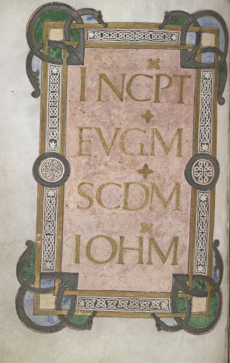
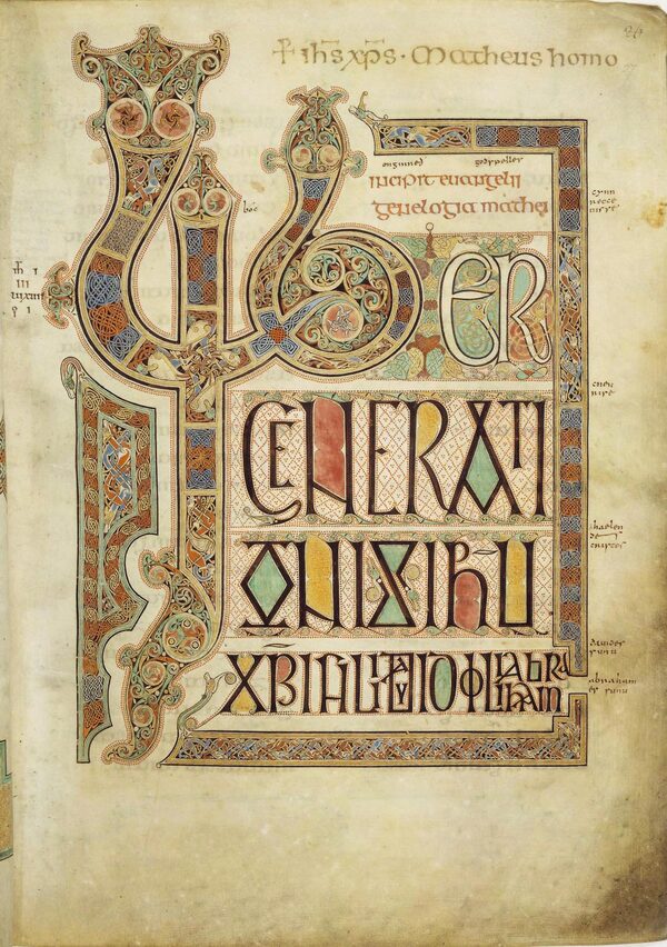
left/ Gospel of John, Egerton MS 768 (9th century) right/ Lindisfarne Gospels (c. 700–720)
Colophon Examples
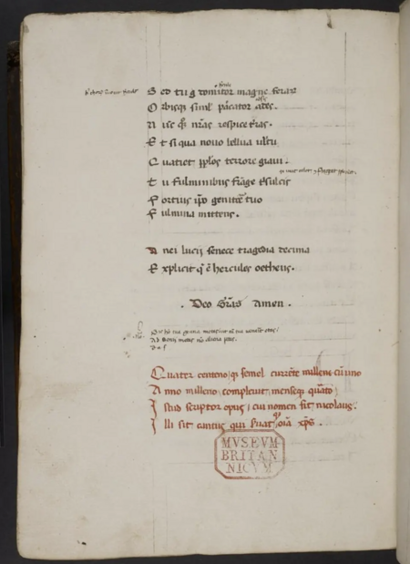
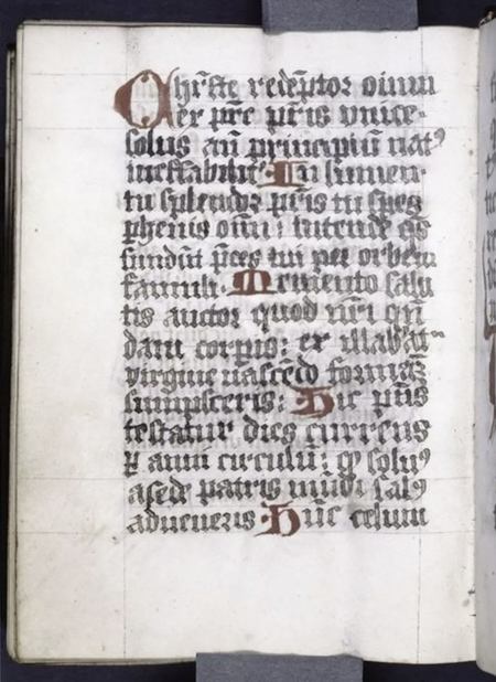
Left/ Lucius Annaeus Seneca. «Tragedies.» Manuscript, 1401. Right/ Medieval manuscript. Germany, 1499.
In the early decades of European printing, during the second half of the 15th century (roughly from the 1460s to the 1490s), the title page gradually acquired independent significance and became an important part of the book’s design. Initially, a blank page was left at the beginning of the text block, which later came to be used for a brief mention of the work’s title. In the 1470s and 1480s, textual headings became common, and from the mid-1480s, engraved illustrations and printers' marks began to appear. By the 1490s, the title page design became more varied—it incorporated decorative borders and additional publication information. The title page began to inform the reader not only about the book’s content but also about the authors, publishers, and printers involved in its creation. By the beginning of the 16th century, it had fully solidified as a standalone element of the book, serving informational, identification, and commercial functions.
In the second half of the 15th and early 16th centuries, the title page gradually transforms into an essential element of book composition. It features the title of the work, the author’s name, publication details regarding place and date, and information about the publisher or printer. Decorative elements, engraved images, and typographical marks begin to appear incrementally. In English book printing, the first illustrated title pages date back to the 1490s. During the 16th and 17th centuries, the visual component gains increasing importance: the illustration begins not only to adorn the page but also to help convey the book’s content, shape its identity, and attract a potential buyer [1; 2].
The spread of the frontispiece—an illustration placed opposite the title page—marks an important stage in the development of book design. This allows the text and image interaction to extend beyond a single page: they form a unified composition in which the visual image can supplement, interpret, or symbolically represent the work’s content. Consequently, the title spread emerges as a distinct form of organizing the book’s beginning.Over the subsequent centuries, the title page continued to evolve alongside advances in typography, printing technology, and graphic design. Studies of 18th-century title pages reveal that their design depended not only on the book’s content but also on the efforts of publishers, printers, and engravers. The composition, font selection, and placement of ornamentation resulted from the collaborative work of several participants in the book production process [2]. Thus, the title page served not only an informational function but also helped to identify the edition, shape its visual identity, and promote it in the book market.
The research hypothesis posits that the evolution of the title page was not solely driven by the need to identify the book, but also by its gradual transformation into an independent visual instrument. The shift from a standalone text page to an illustrated title spread reflects changes in printing technologies, book culture, and the principles of visual information organization.
Index:
Introduction
Chapter 1: From Colophon to Title Page: The Formation of the New Book Page (15th–16th Centuries)
Chapter 2:
Chapter 3:
Conclusion
Bibliography
Ruokkeinen S., Suhr C. «Necessary Tables of Most Usefull Consequence»: Graphic Devices and Title Page Promotion in Early Modern English Print // Neophilologus. — 2026. — Vol. 110. — P. 389–406. — URL: https://link.springer.com/article/10.1007/s11061-026-09873-3 (Accessed: 12.11.2026).
Araújo A. de Melo. The First Page of History: Material Configuration and Functions of the Title Page in German 18th-Century History Books // Anais do Museu Paulista: História e Cultura Material. — 2020. — Vol. 28. — P. 1–37.— URL: https://www.scielo.br/j/anaismp/a/j5YNQs5kCYFgwk65VQKBGfy/ (Accessed: 12.11.2026).
Image sourceshttps://commons.wikimedia.org/wiki/File:Incipit_to_St_John%27s_Gospel__Gospels_of_St_Luke_and_St_John_(9th_C), f.62v-_BL_Egerton_MS_768.jpghttps://commons.wikimedia.org/wiki/File:LindisfarneFol27rIncipitMatt.jpghttps://picryl.com/media/colophon-from-bl-harley-2481-f-272v-473837https://nypl.getarchive.net/media/explicit-of-main-text-end-of-hand-one-colophon-with-name-of-scribe-and-date-fcac7a