concept
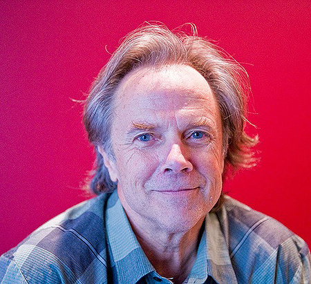
David Carson is a graphic designer, art director, and surfer. His work for Beach Culture and Ray Gun magazines in the 1990s introduced a new approach to typographic and layout design, breaking away from traditional composition systems. He continues to explore the possibilities of graphic design, especially typography as a form of self-expression in print and video for commercial and cultural clients.For my visual research, I would like to begin by analyzing an interview Designboom conducted with David Carson to better understand his thought process and approach to his work.
Designboom Interview with David Carson. Key questions regarding his work and a deep dive into his worldview.
Designboom (DB): What initially inspired you to become a graphic designer?
David Carson: I didn’t actually aspire to be a graphic designer, and honestly, I didn’t until I was a respectable age of 26! Graphic design became a second career for me. I have a degree in sociology, and I taught it for several years. Then, completely by chance, I attended a two-week summer seminar at the University of Arizona focused on what is called «graphic design.» It changed everything. Before that, I didn’t even know the term «graphic design.»
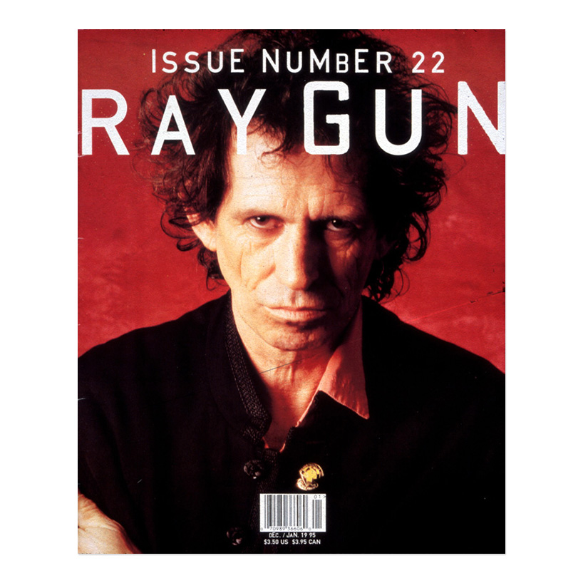
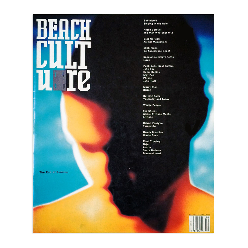
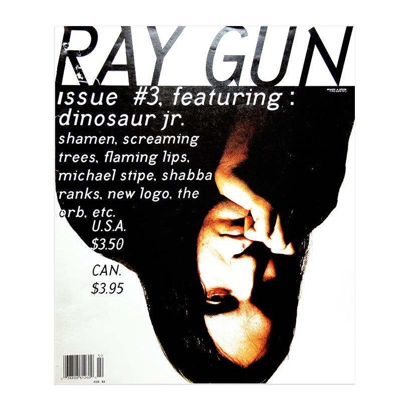
- Beach Culture Magazine, October 1990 «This is one of Anton Korbin’s first color works. We published a photo report on his work, and when I saw Editor Neil Fineman’s theme for this issue—'the end of summer'—I thought this image was perfect. It conveys the mood of late summer, even though it wasn’t commissioned for that specific purpose.»2. Ray Gun Magazine, February 1993 «The subject of the interview for this article, J. Mascis from the band Dinosour Jr., talked about how much he hates the press, magazines, media, etc. — here’s my reaction to his comments: I used a promotional photo sent by the record label and turned it upside down. It’s funny to see it in articles and stores in that way!»3. Ray Gun Magazine, January 1995 «Ray Gun didn’t have a grid, a formula, or a specific format; the music and individual articles determined the design and layout direction. Each page was a completely new design challenge, which made the work much harder than in most magazines, but also much more interesting—and I think it yielded more effective results. The editor gave me several cover options, including one about how Keith Richards candidly talked about sex, drugs, rock 'n' roll, and so on. I looked at that portrait and realized there was nothing else to say—the face spoke for itself. This is often a hotly debated topic among editors: many believe the cover should feature everything in the issue, while others have rules about where headlines MUST be placed. It turned out that this cover, WITHOUT headlines, became our best-selling issue—it’s funny, we thought Keith looked really old back then.»
DB: How would you describe your approach to design?
David Carson: My approach is experimental, intuitive, and personal. I don’t have a formal education, which I believe has been very helpful, because I never studied what I was supposed to be restricted to; I simply did what seemed logical to me. I think my interest in sociology initially led me to editorial design because I worked with real stories, real people, and events—sometimes with music. My starting point has always been, and remains, reading articles or anything else I’m given. I strive to visually reinforce what is written, said, or sung. I want the work to establish an emotional connection with people—that is, in my opinion, where it is most effective and lasting.
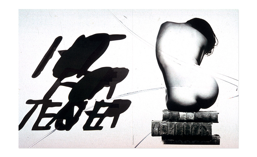
In an article on beach culture titled «Infatuation with a Teacher,» «Various rock stars talked about school teachers they were attracted to. I really liked this picture: the teacher sitting on books, and the way that guy is passionately leaning toward her.»
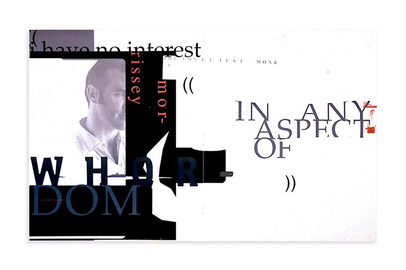
Ray Gun magazine. «One of my favorites—the intro graphic for a long piece and interview with the singer-songwriter Morrissey. While reading the article, I stumbled upon a wonderful quote: ‘I am not interested in any aspect of promiscuity whatsoever.’ I decided to use it in a large format for the intro graphic, trimming it slightly because it was quite enigmatic in that interview and generally at the time.»