Original size 1140x1600

Art practice with a light touch of liberation

PROTECT STATUS: not protected
Longread translated automatically

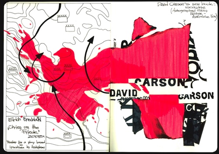
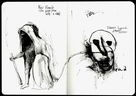
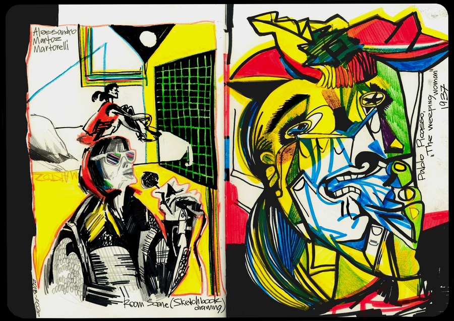
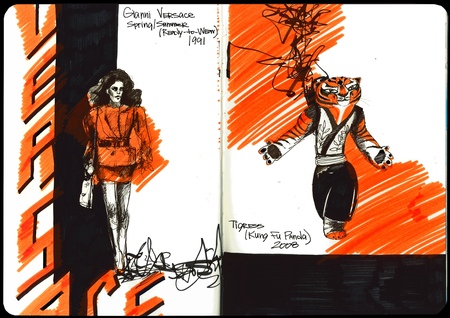
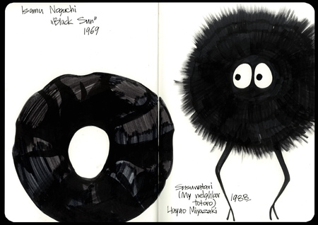
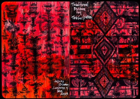
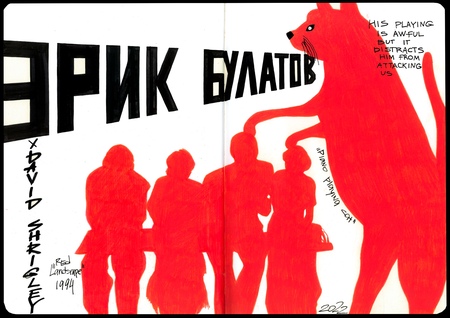
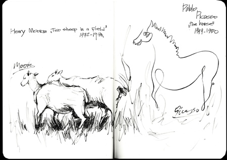
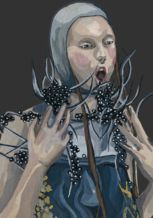
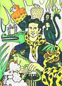
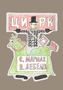
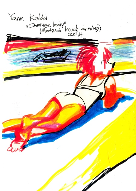
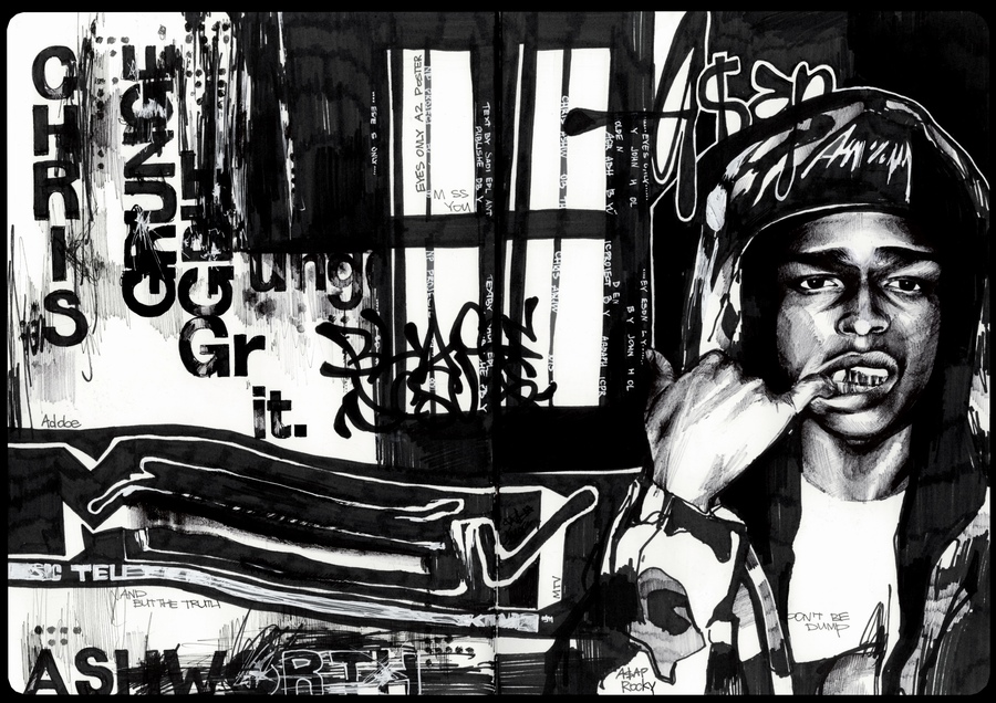
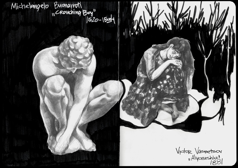
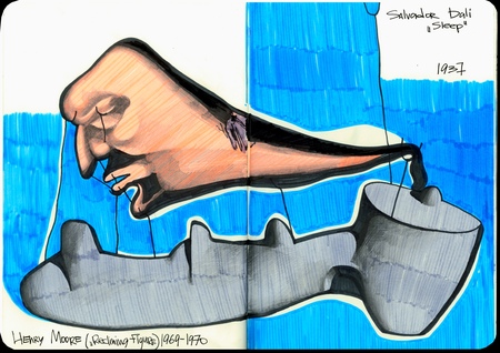
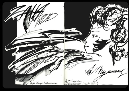
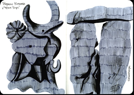
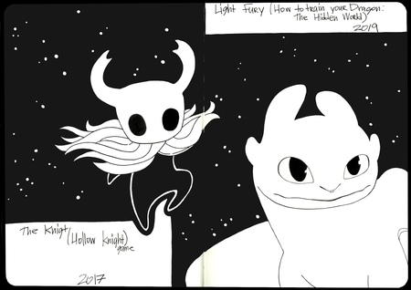
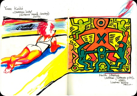
This project is not about building a unified color system or forcing the images into a single rule. What matters more is the feeling: how color, form, texture, line, and disparate artistic languages collide. The word on the cover is less of a provocation and more a permission to not conform. To not search for the perfect combination, to not fear dissonance, and to trust one’s visual response.
big
Original size 2360x1668
big
Original size 2360x1668
big
Original size 2360x1668
Art practice with a light touch of liberation
Project created at 29.09.2026
Vasilisa Kostava
Моё летнее визуальное исследование в скетчбуке — это поиск связей в работах по цвету, форме и смыслу. Я назвала его resort ’26, потому что он не вписывается в строгие рамки одного жанра
Anastasiya Kabakova
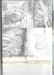
Мой летний проект в чб!
Olga Vronskaya
великое, всеми любимое летнее (сентябрьское) домашнее задание
adcr.dafes
The Art Directors Club of Russia sets the benchmark for creative excellence in design and advertising, serving as a central hub where industry professionals connect. Since 2004, the Club has hosted the ADCR Awards—a premier national competition celebrating creativity, design, and advertising. The core mission of the awards is to champion agencies and independent creators making their mark in the local market. By presenting this honor on behalf of the professional community, the Club reaffirms its endur... Show more
adcr advertising
adcr design
adcr students and young creators