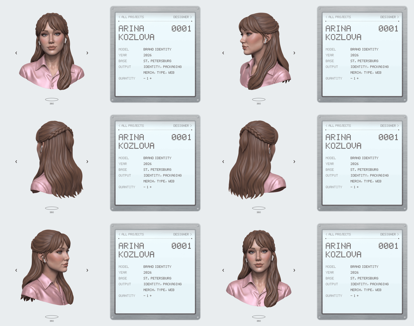
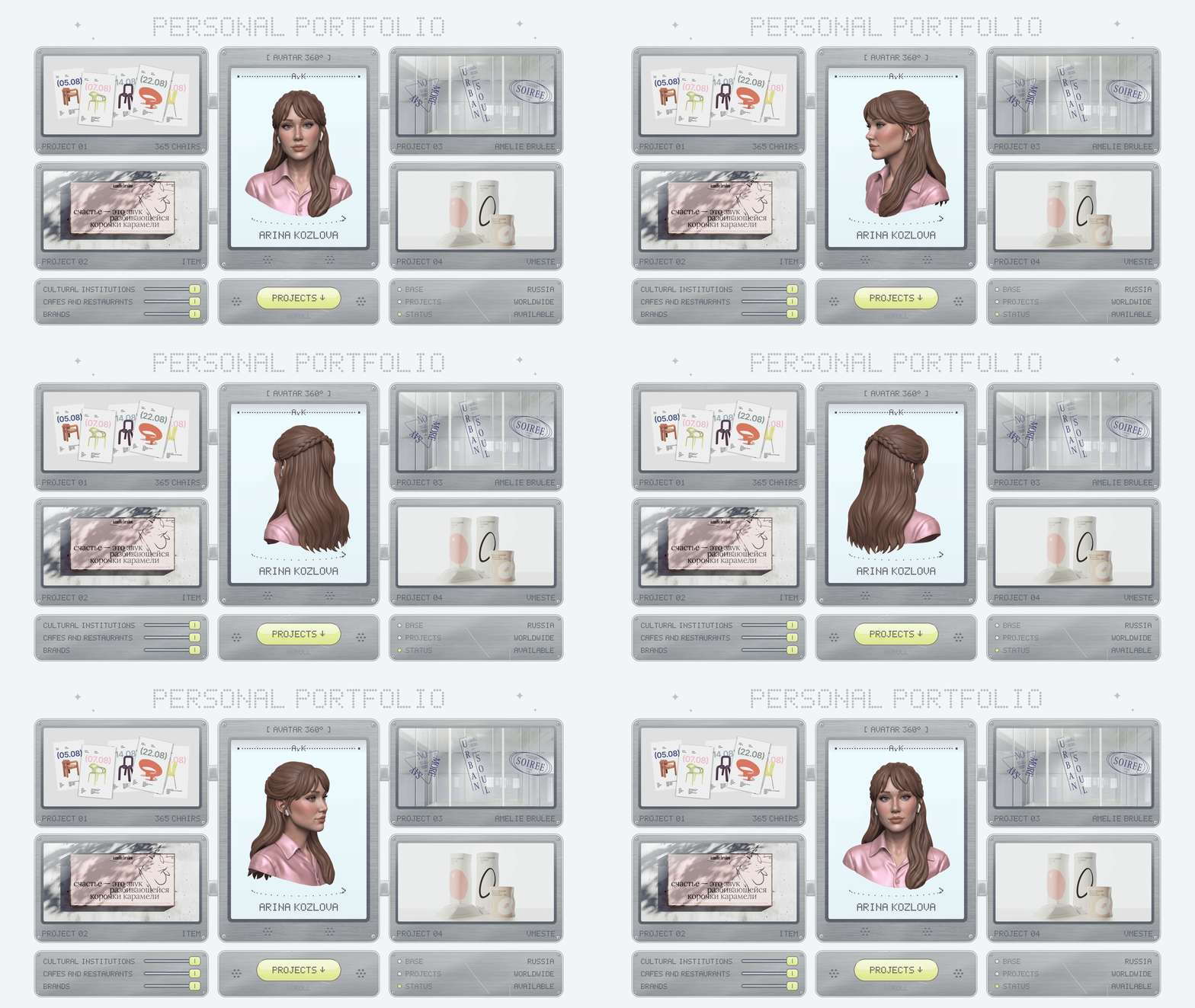
Hi, I’m Arina Kozlova. I design brand identities, packaging and typefaces for museums, cafés and design brands.
Below are seven of my projects, from a metal museum to a dairy and my own typeface. Each one grew from one simple idea.
About me
From 2023 to 2026 I was art director at Zerkalo Design Studio in St. Petersburg. I led brand and packaging projects for Eburet Studio, Amélie Brûlée, Splav and the dairy brand «O».
Today I take freelance projects from clients in Russia and abroad. I also draw my own typefaces.
Education: B.A. in Design, HSE Art and Design School.
How I work
Projects
I made all seven projects on my own. Under each one you’ll find what exactly I did.
01. 365 Chairs: a tear-off calendar for Eburet Studio
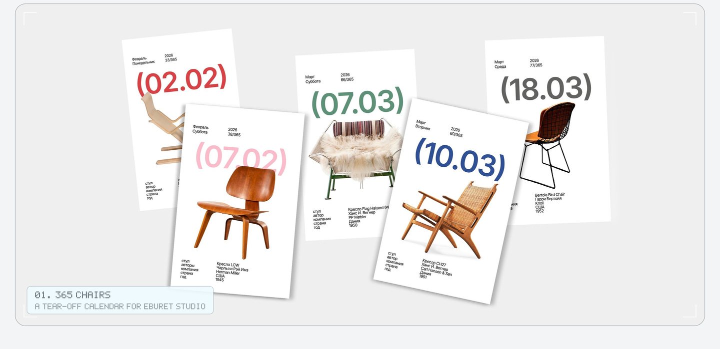
The calendar is a short history of the chair. It opens with the Vienna chair and ends with chairs by Eburet Studio, so the young brand takes its place right after the classics.
The round brackets around each date became the sign of the whole calendar. You find them on every page and on the box, where even the year sits inside them: (2026).
Every page uses one grid: a big date in round brackets, the chair and five short facts about it. The brackets became the sign of the whole calendar. Even the year on the box sits inside them.
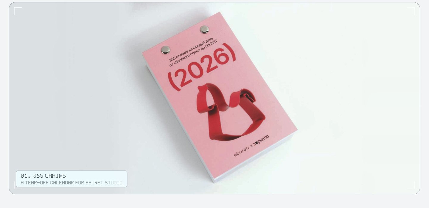
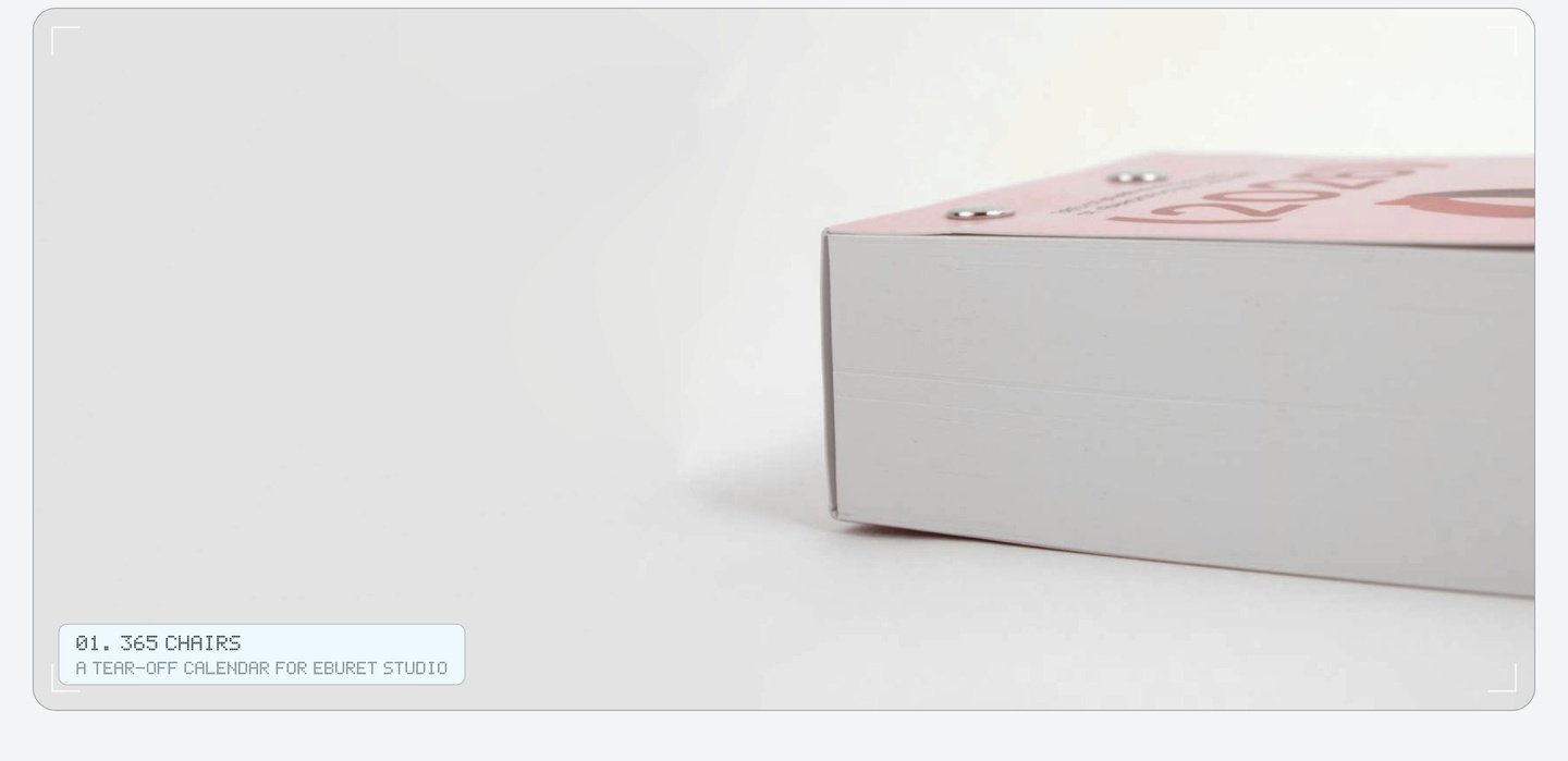
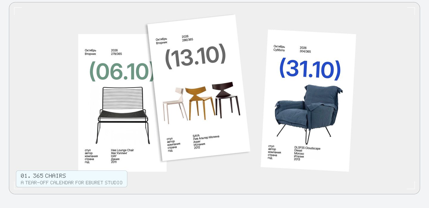
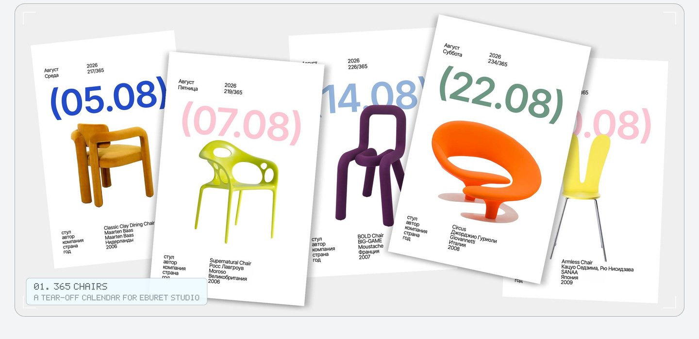
The calendar went on sale in the Eburet Studio online shop. My role: the product idea and art direction.
02. Item: branding for a pop-up store of Russian brands, Nizhny Novgorod
At the door, every guest of Item («Айтем») gets a small passport. Each purchase adds a stamp from that brand. Talks and parties have their own stamps too, and a full passport can be traded for gifts.
The stamps are also the look of the store, from the shop window to the tape on a box. Only the Cyrillic logo never changes.
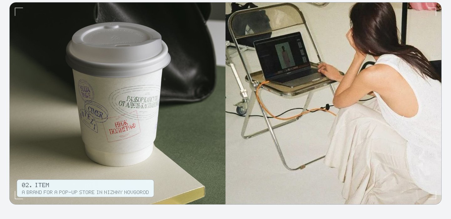
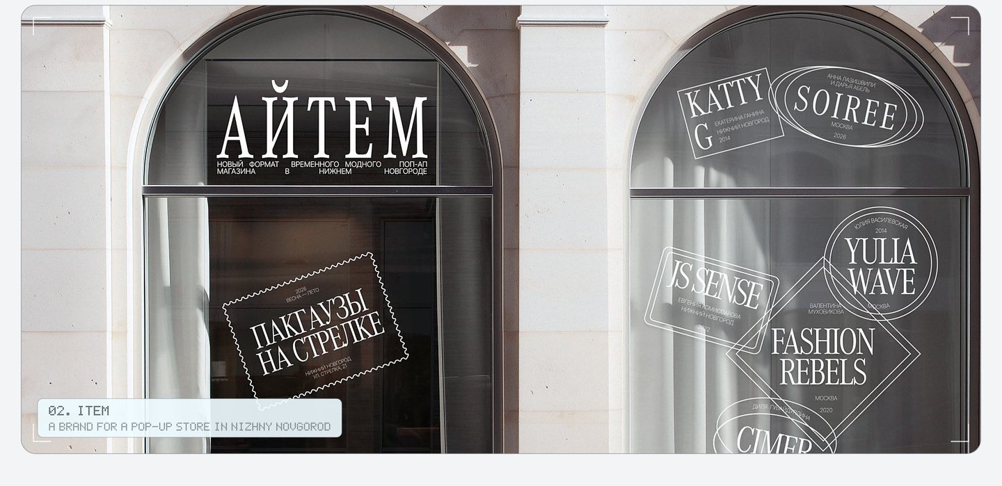
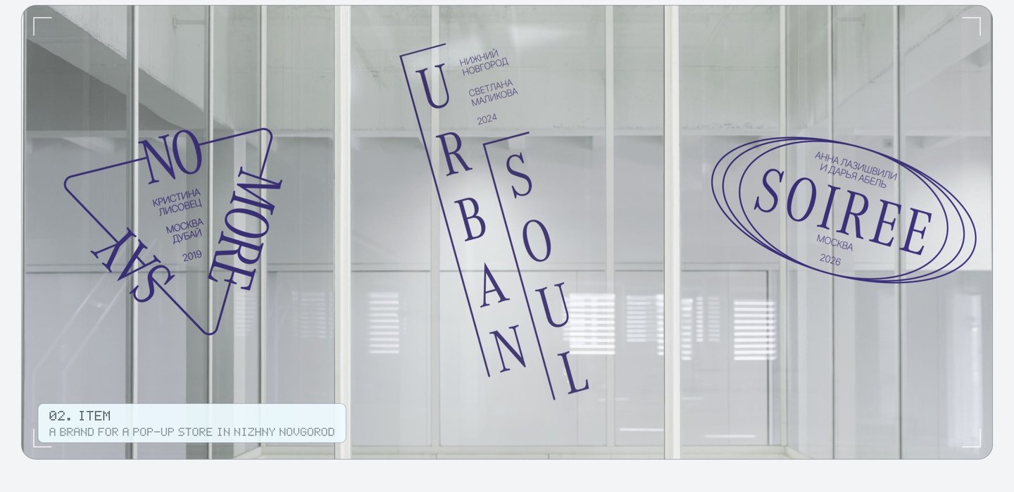
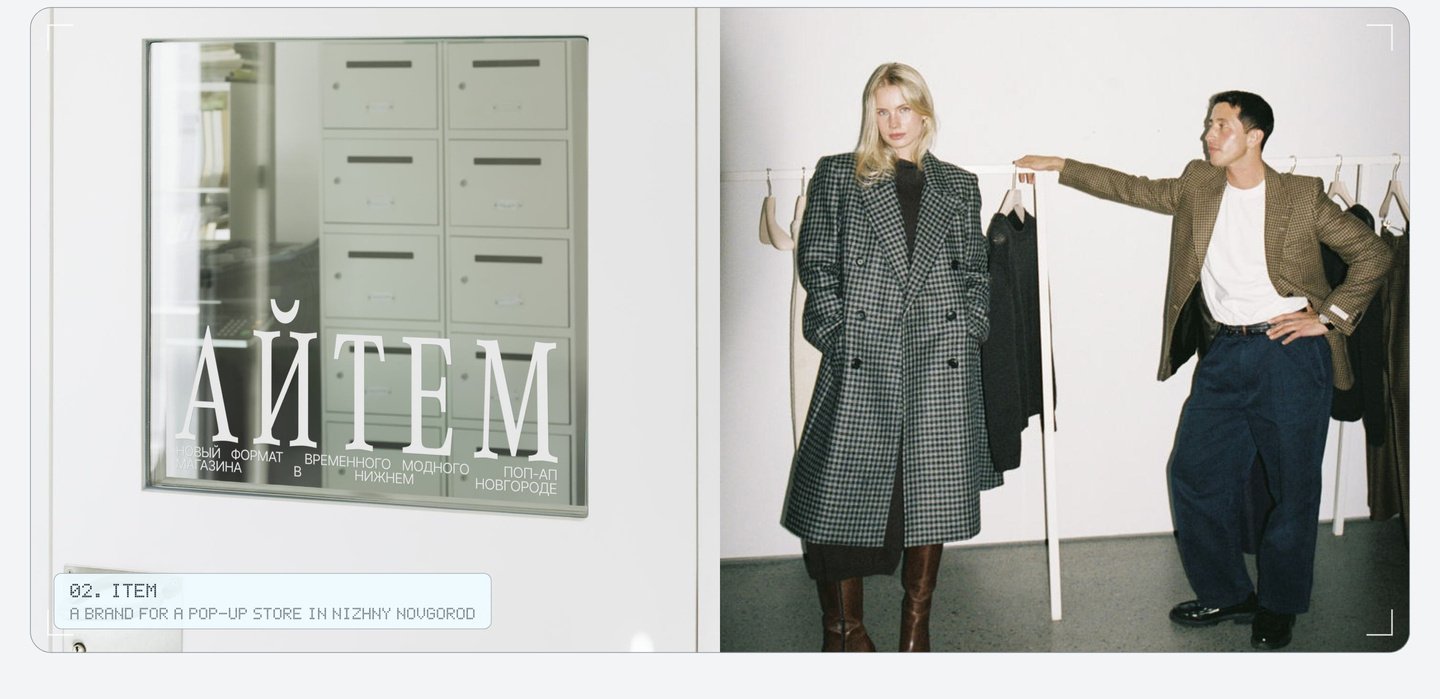
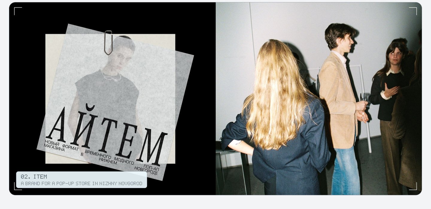
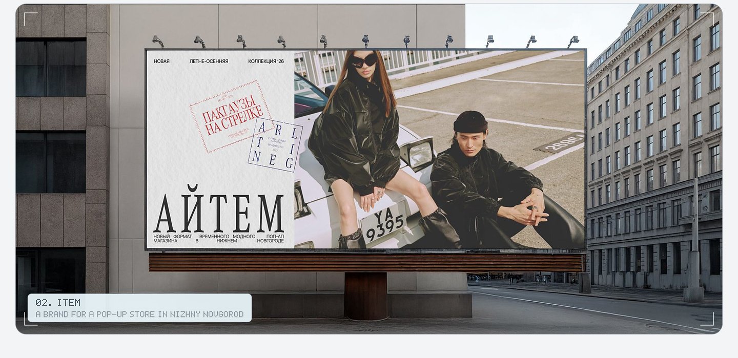
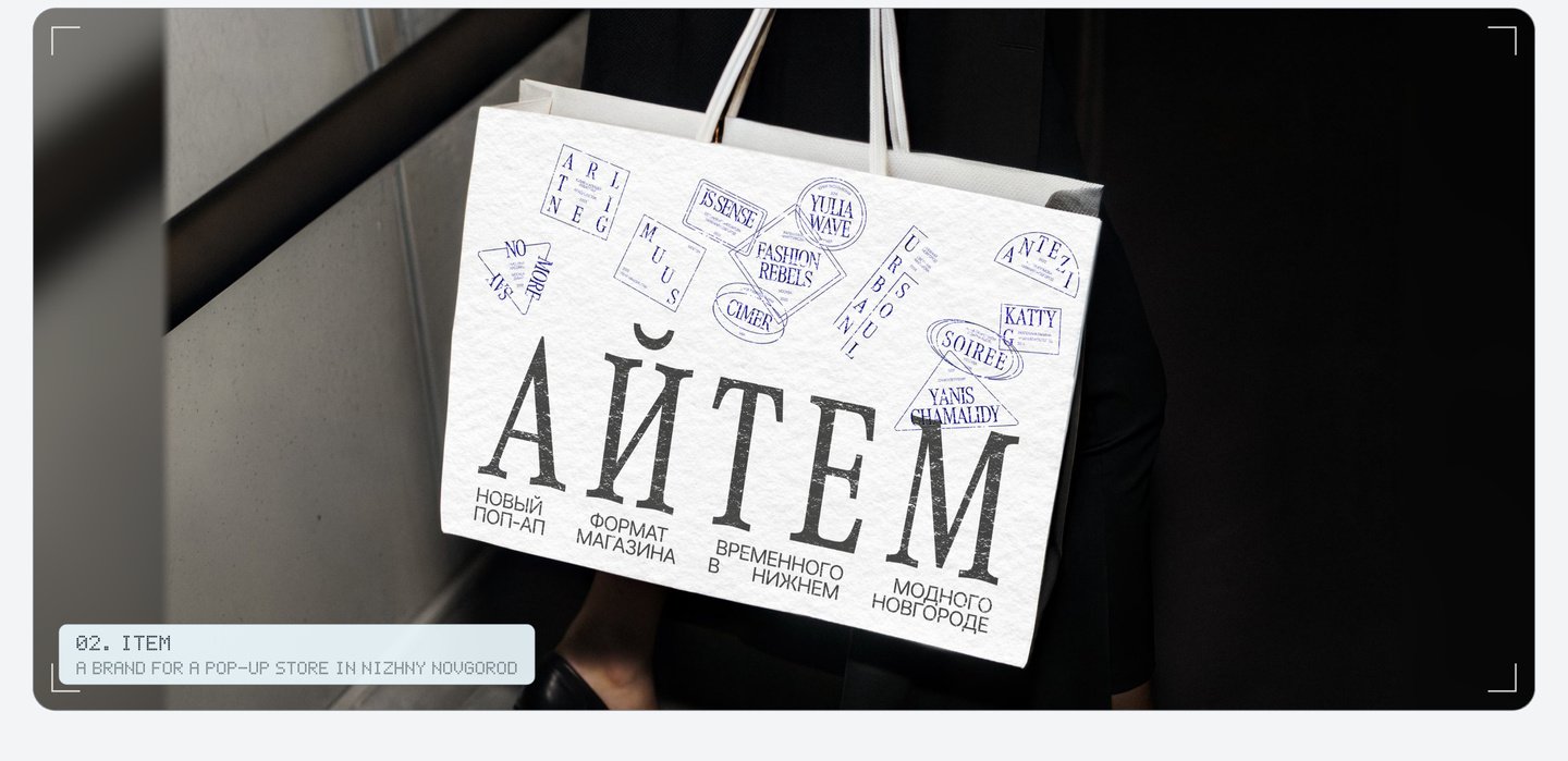
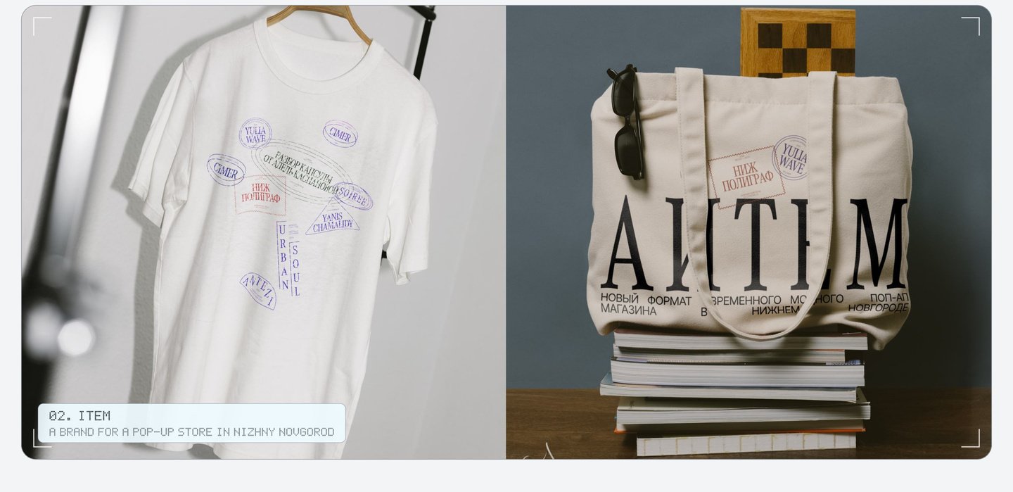
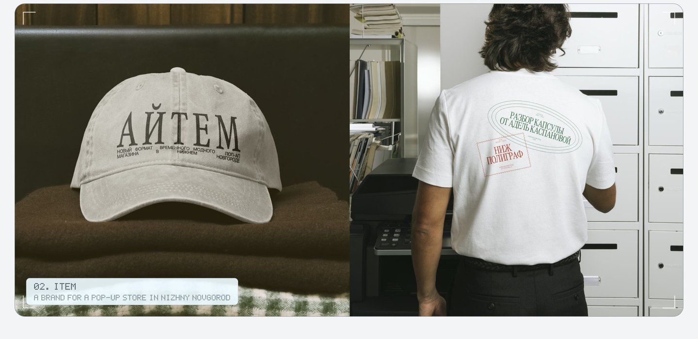
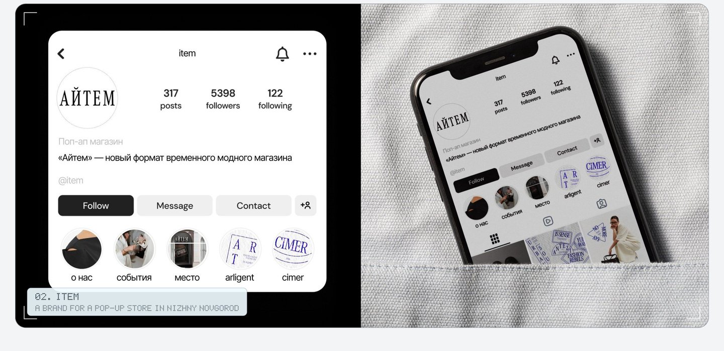
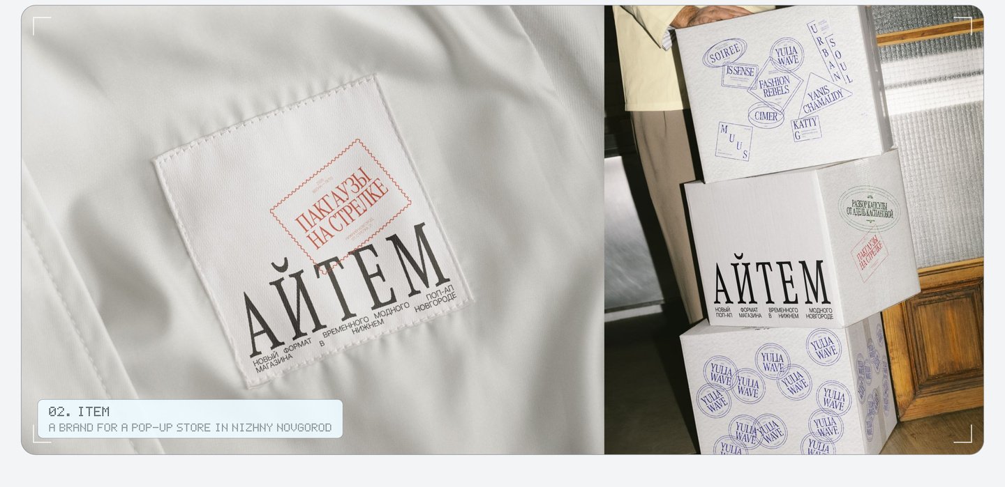
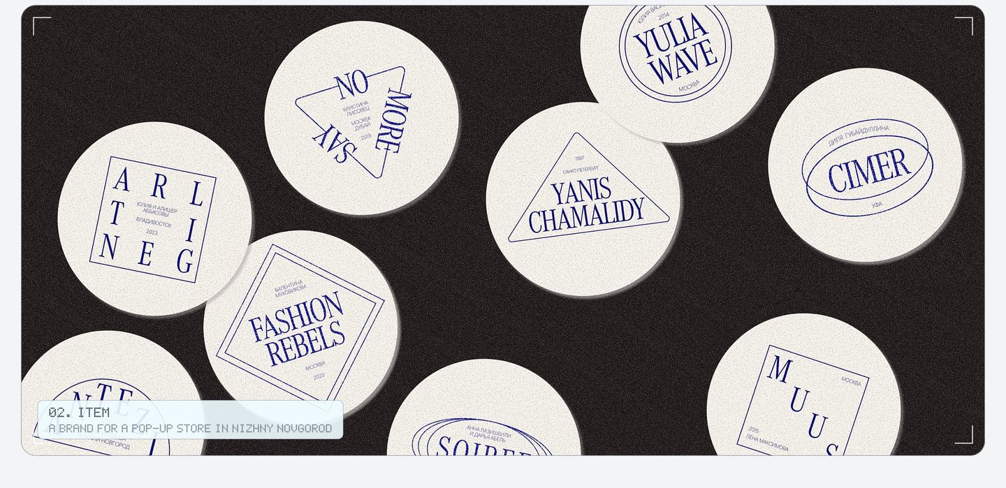
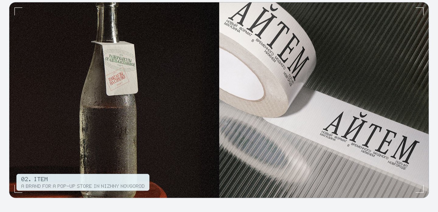
A new brand joins the store with one new stamp. My role: the passport idea, the Cyrillic logo, the whole set of stamps and how they live on bags, cups, windows and social media.
03. Amélie Brûlée: branding and packaging for a café and bakery in St. Petersburg
I drew every picture by hand, fast and a little messy, like notes in the margins of a diary. The boxes and bags use old French patterns: soft stripes and big polka dots. Short phrases about small joys run across totes and boxes, like «Happiness is the sound of a cracking caramel crust.»
Three rules hold it together: a hand drawing, a line of text that changes its place, and a French pattern.
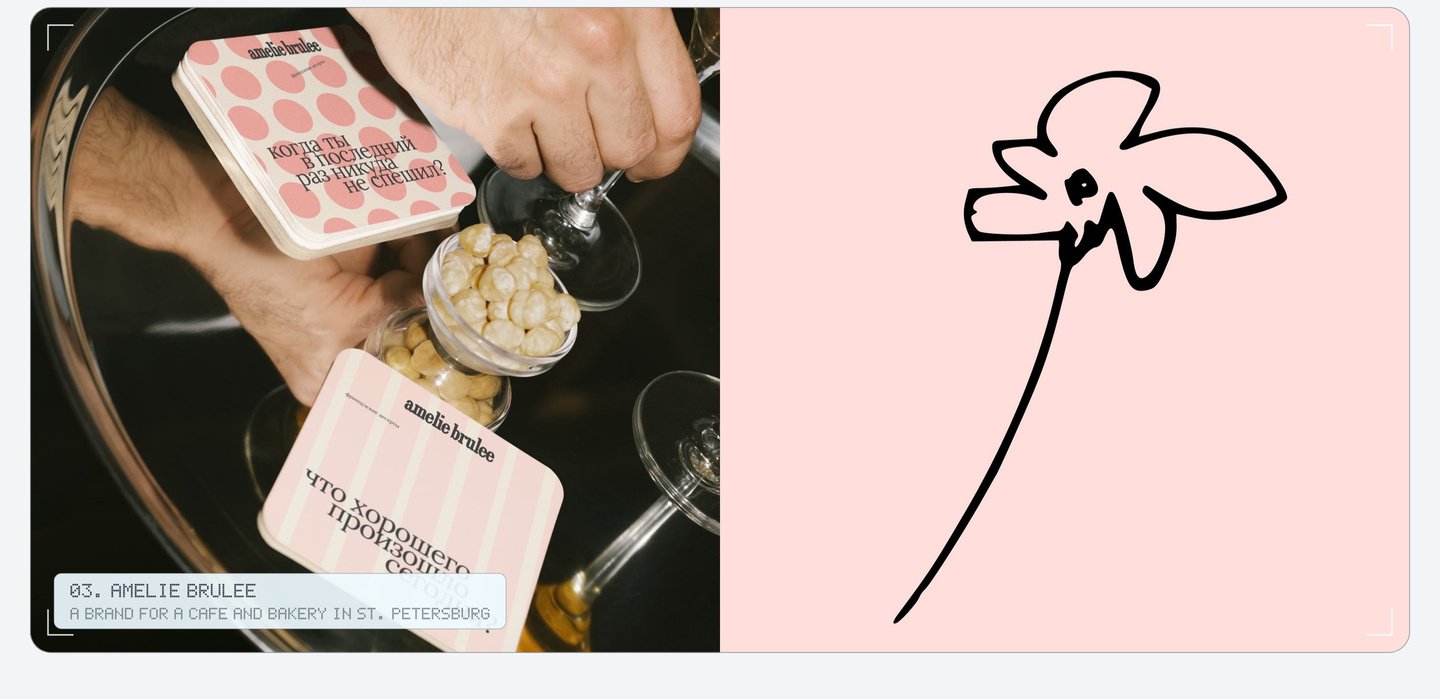
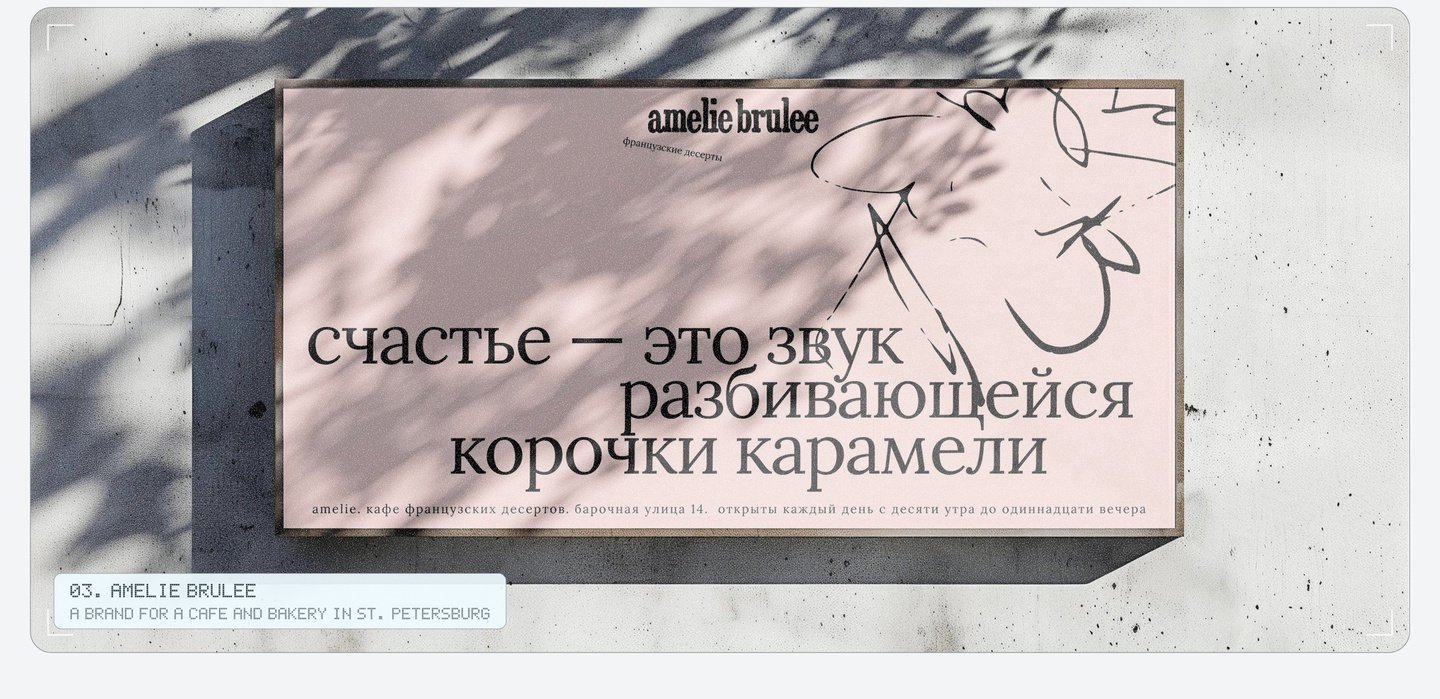
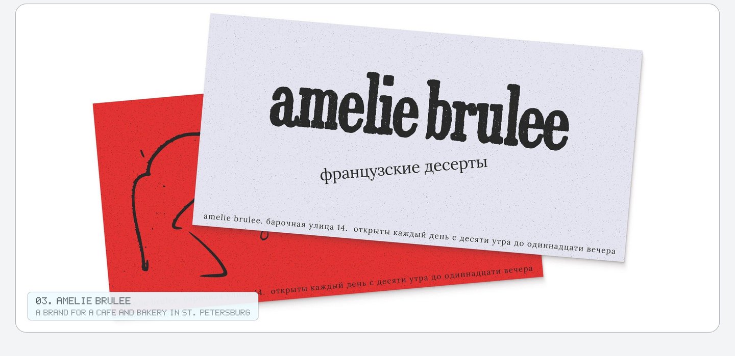
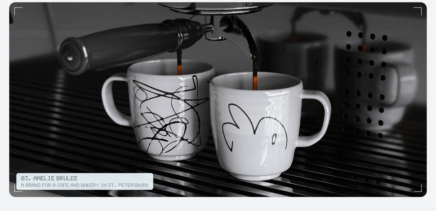
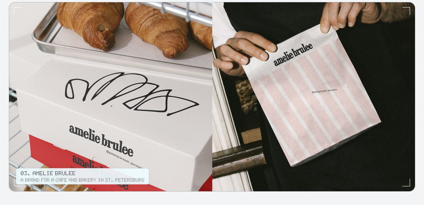
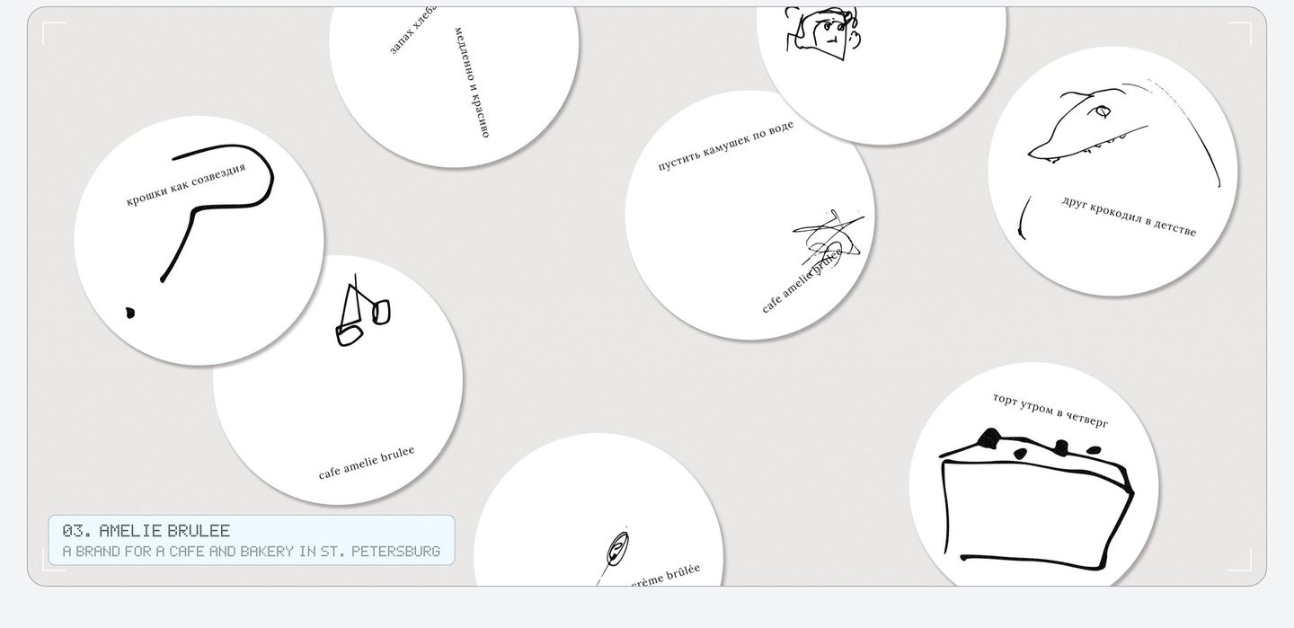
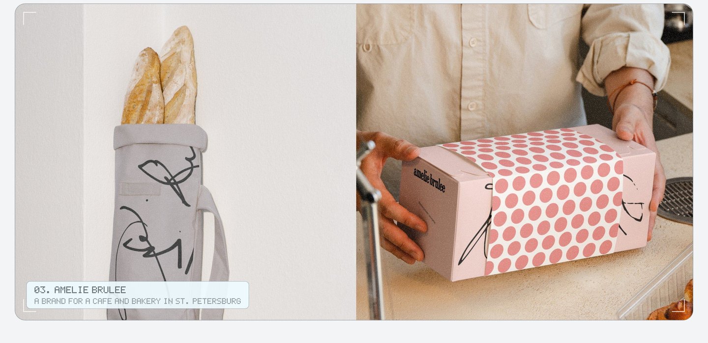
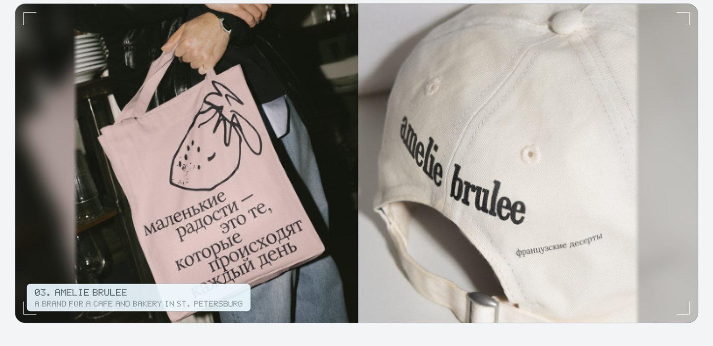
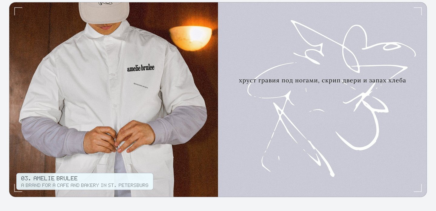
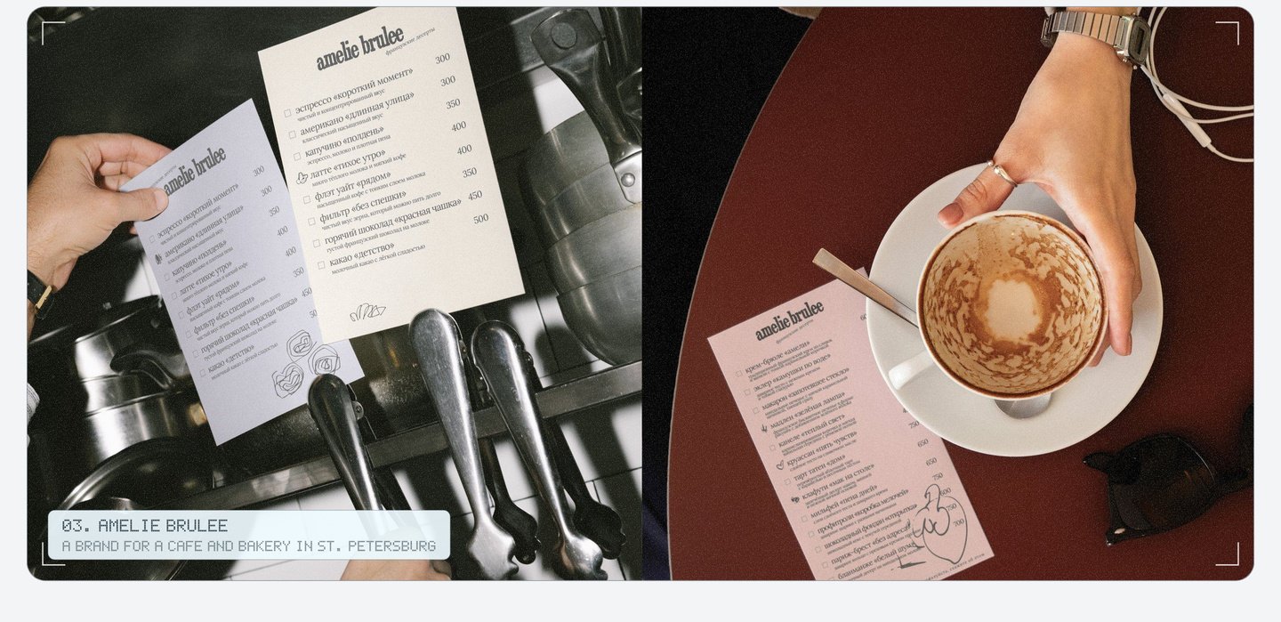
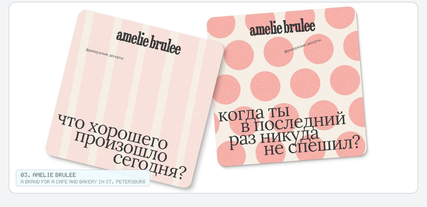
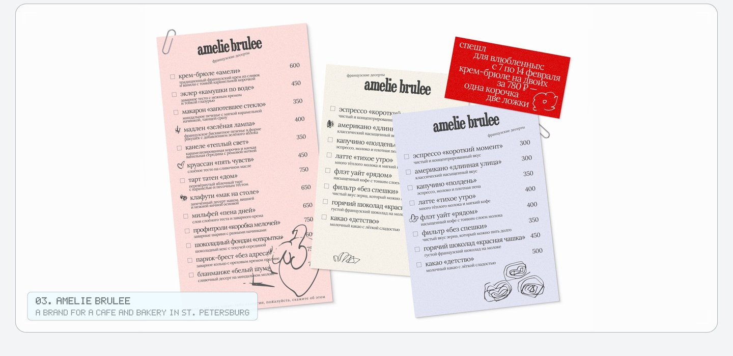
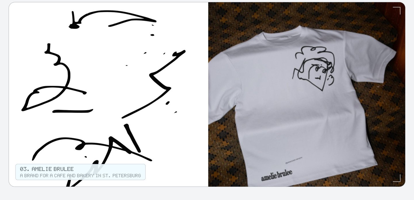
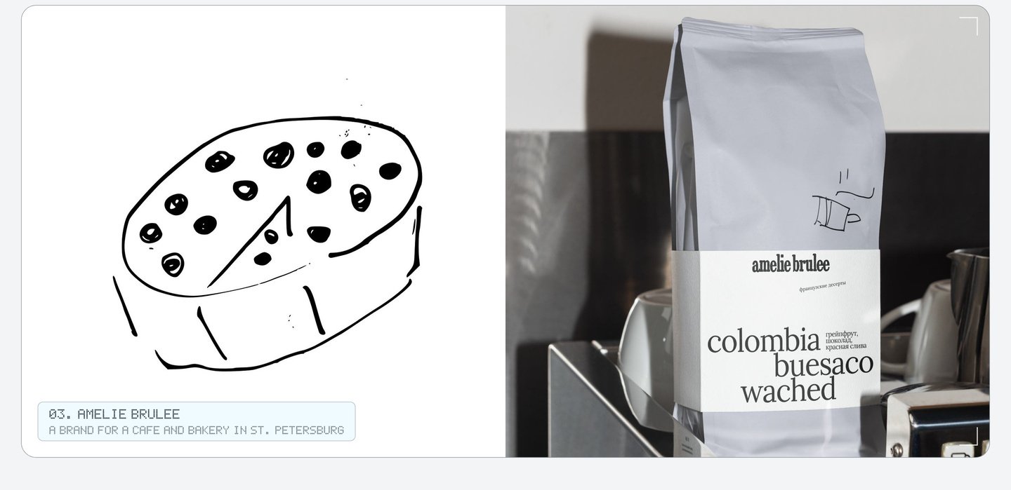
With these rules the team can make a new cup, menu or bag, and it still feels like Amélie Brûlée. My role: the idea, all the drawings, the logo, the patterns, the phrases and the packaging.
04. Vmeste: branding for a cultural center in St. Petersburg
Vmeste («Вместе») gives each week to one culture: Latin America, China, Scandinavia and more. The logo stays put. On top of it go stickers with words from that culture, on posters, billboards, totes, mugs, socks and the website.
Every object is named in several languages, so even a mug teaches you a new word. The staff wear name stickers too.