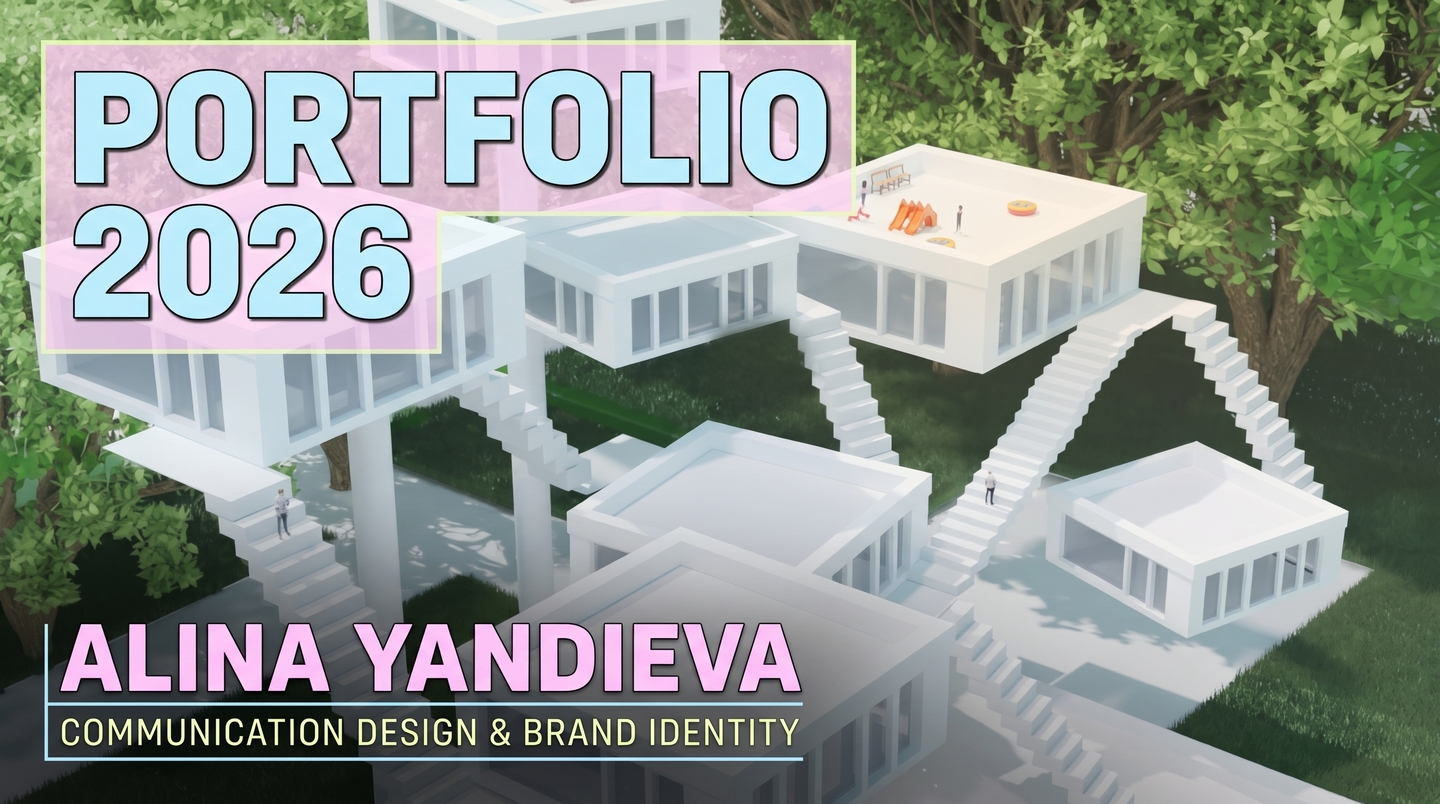
01 / COMMUNICATION DESIGN & BRAND IDENTITY
Hi, I’m Alina Yandieva. I turn lost meanings and complex ideas into structured brand worlds.
I am a 21-year-old communication and identity designer from the HSE Art and Design School. I don’t just draw isolated logos—I build holistic visual ecosystems that unite modular geometry, 3D graphics, multi-page editorial navigation, and tactile packaging.
YOUR GUIDE / THE KEEPER BOX
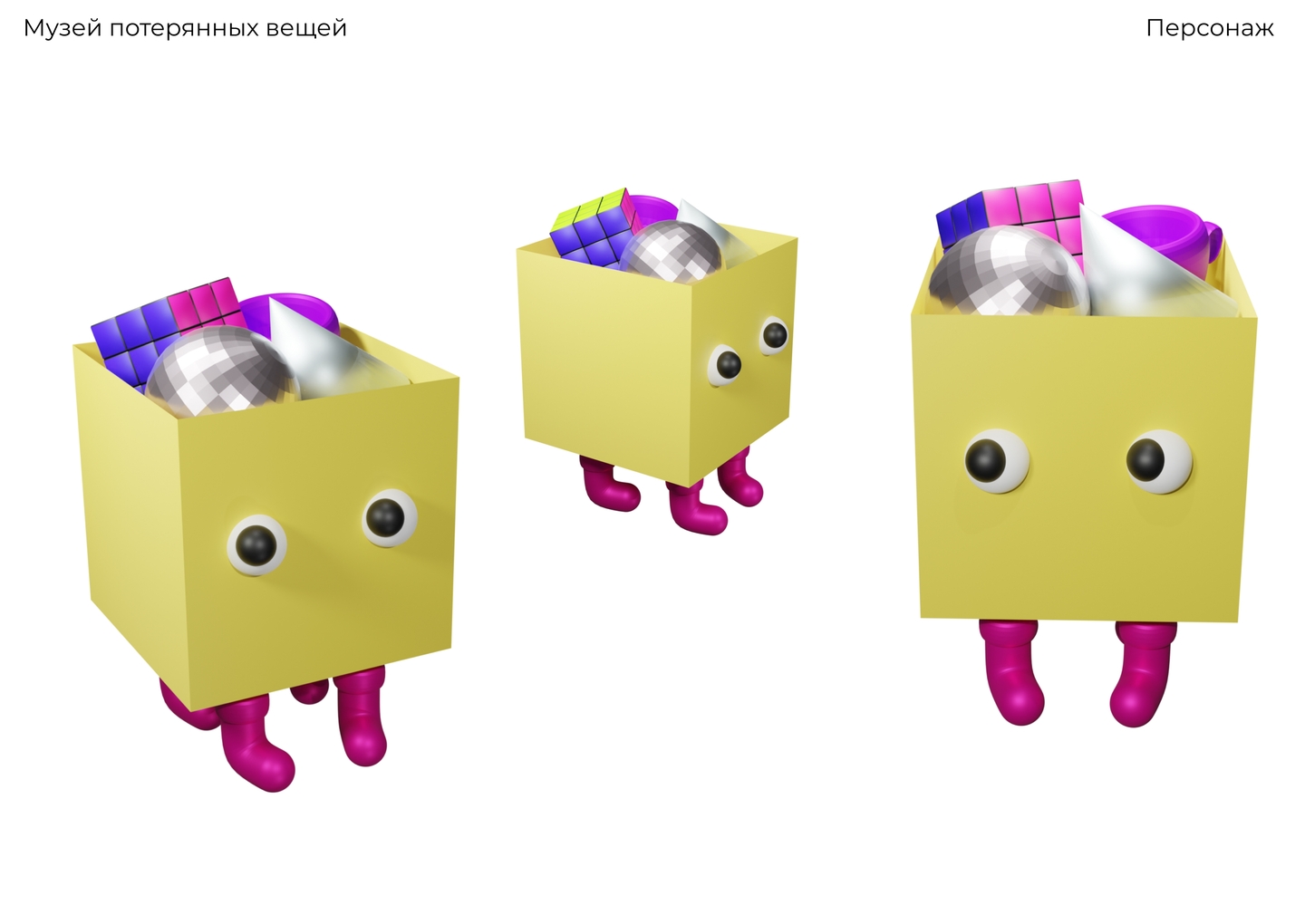
«Hello! I am the Keeper Box from the Museum of Lost Things. Inside me, I carry forgotten Rubik’s cubes, disco balls, and—most importantly—missed business opportunities. Scroll down with me: I will show you how Alina helps brands find their true visual voice, save their customers’ time, and never get lost in a crowded market.»
02 / THE PROBLEM, MY SOLUTION & B2B OFFERWhy do big brands lose customer attention?In an oversaturated market, businesses suffer from fragmented visuals: their packaging, digital posters, and navigation speak different languages, losing both audience trust and valuable time.My Solution: I engineer scalable identity systems where a single graphic DNA adapts effortlessly from a tiny label to 3D architecture and retail shelves.What I Offer to Large Businesses & Enterprises:1. Full-Scale Brand Identity: Strategy, archetypes, logos, and modular visual guidelines.2. FMCG & Retail Packaging: Eco-friendly dielines, food sleeves, and high-conversion shelf presence.3. Multi-Channel Campaigns & Wayfinding: 3
CASE 01 / FLAGSHIP IDENTITY SYSTEMThe Museum of Lost Things — Visual IdentityRole: Concept, Modular Grid, Logo System, Brand Guidelines & MerchThe Premise & Problem: Imagine that every object you have ever lost ended up in one place, waiting to return to its owner. What would you go back for? The challenge was to create a visual identity for a museum where people rediscover not only lost items, toys, and artifacts, but also missed time and opportunities.
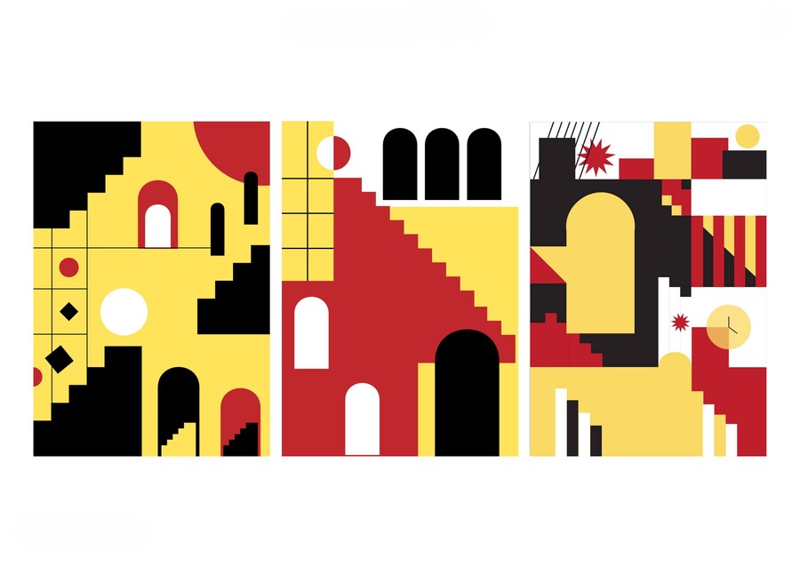
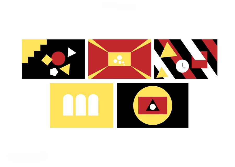
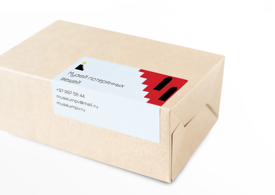
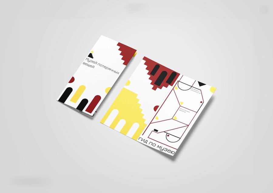
CASE 01 / APPROACH, SOLUTION & RESULTArchitecture of Search: Stairs, Arches, and Geometric RhythmThe Approach: Searching for a lost thing feels like walking through a labyrinth. I translated this feeling into a strict constructivist language of black staircases, arched doorways, red triangles, and yellow solar circles.The Result: A minimalist sign (a yellow sphere hovering over black steps) and an infinitely scalable modular pattern that brands everything from return-delivery parcel boxes and business documentation to flags, notebooks, tote bags, and apparel.
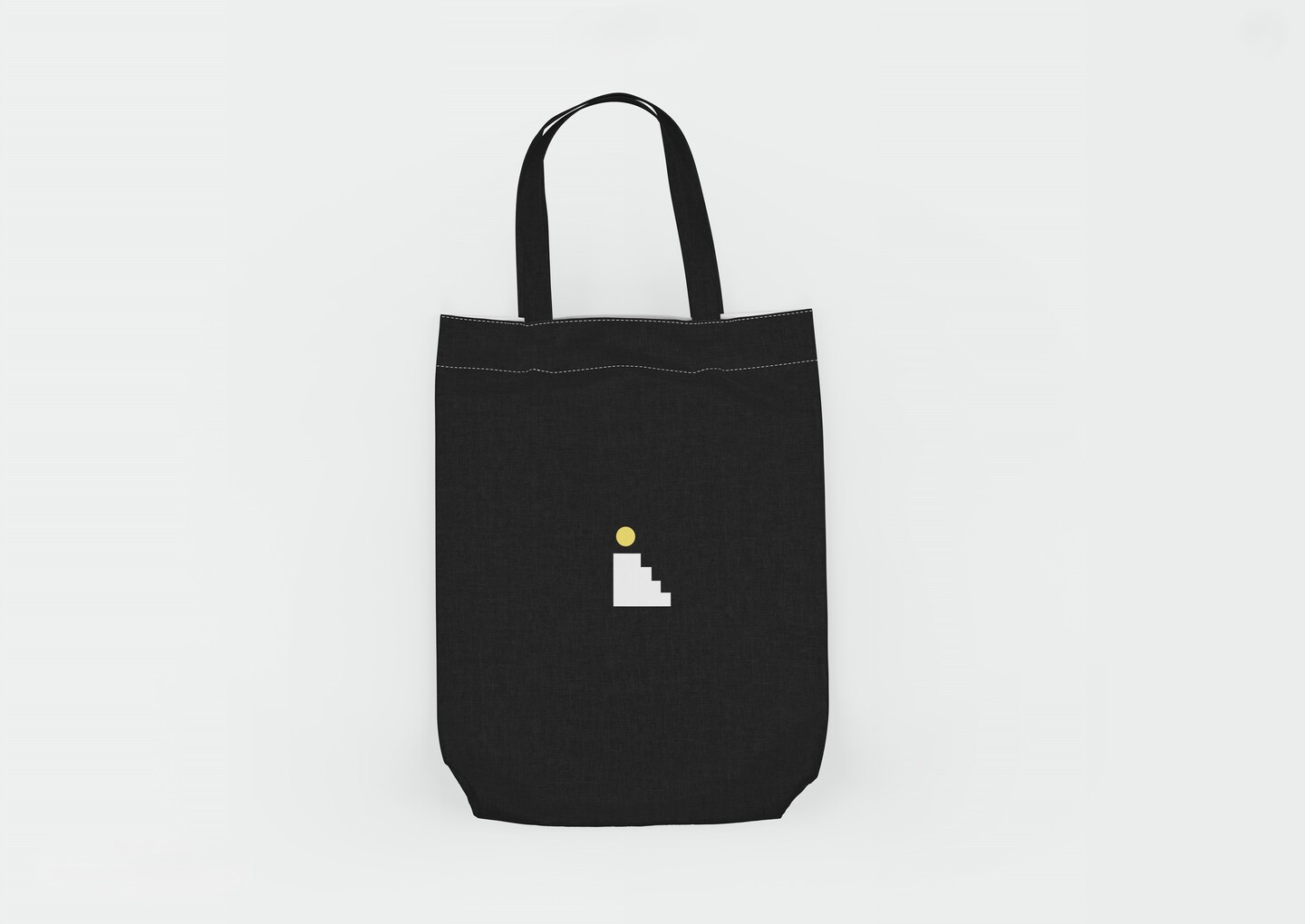
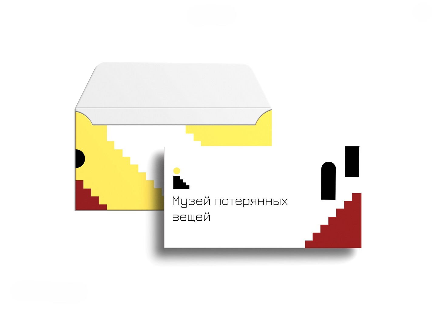
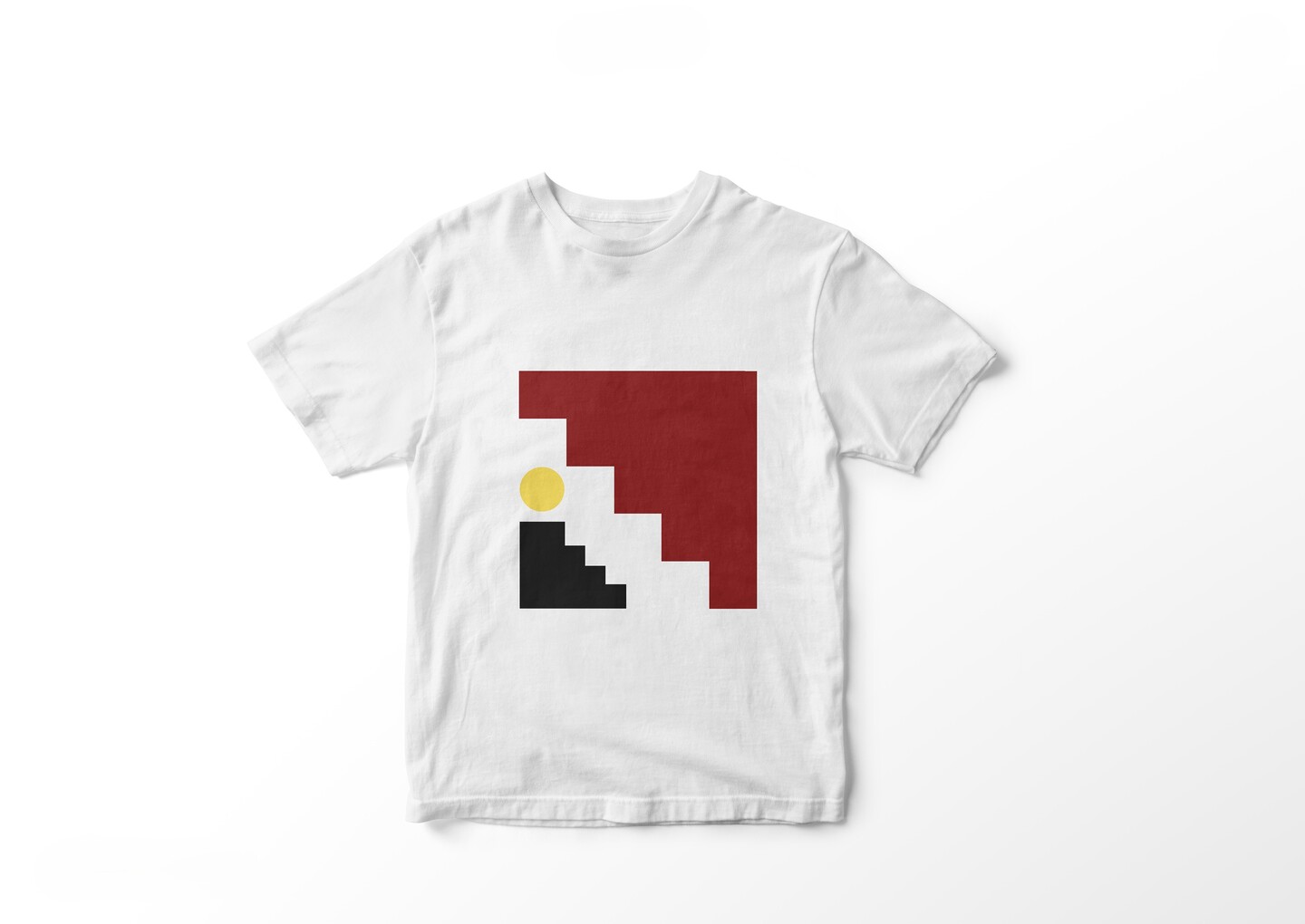
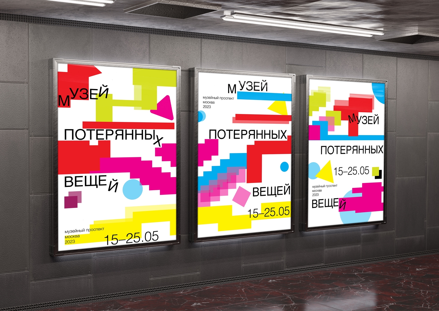
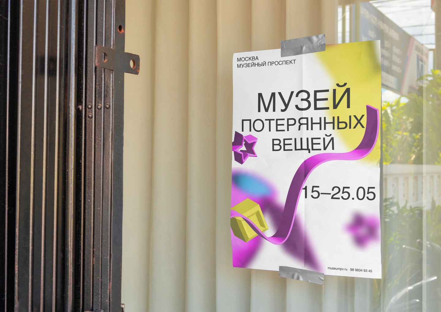
CASE 02 / CAMPAIGN & 3D CHARACTER DESIGNPosters for the Museum of Lost ThingsRole: Art Direction, 3D Character Modeling, Experimental Typography, Outdoor MediaThe Challenge: How do you take a strict museum identity onto busy city streets and subway stations so commuters stop in their tracks?The Idea: Expand the brand’s emotional range by introducing a 3D mascot—a living yellow Lost-and-Found Box overflowing with bright memories—alongside interactive street formats that turn passersby into active participants.
CASE 02 / MULTI-LEVEL POSTER SYSTEMTo reach different urban audiences, I developed four distinct poster series:01 / Scattered Grid: Bold black letters tumbling across a swiss grid like misplaced items.02 / Street Tear-Off Ads: Witty paper flyers («We have your lost things») mimicking neighborhood lost-item notices.03 / Acid Pixel Stairs: High-contrast neon posters bringing the staircase motif into underground transit.04 / 3D Ribbon Series: Glossy 3D compositions uniting the character and dynamic purple waves.
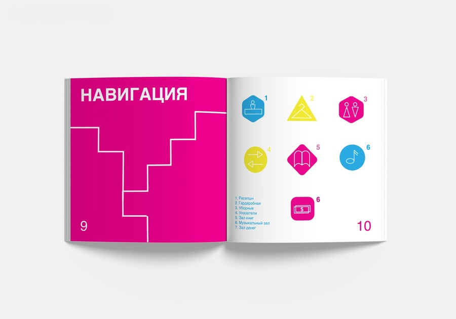
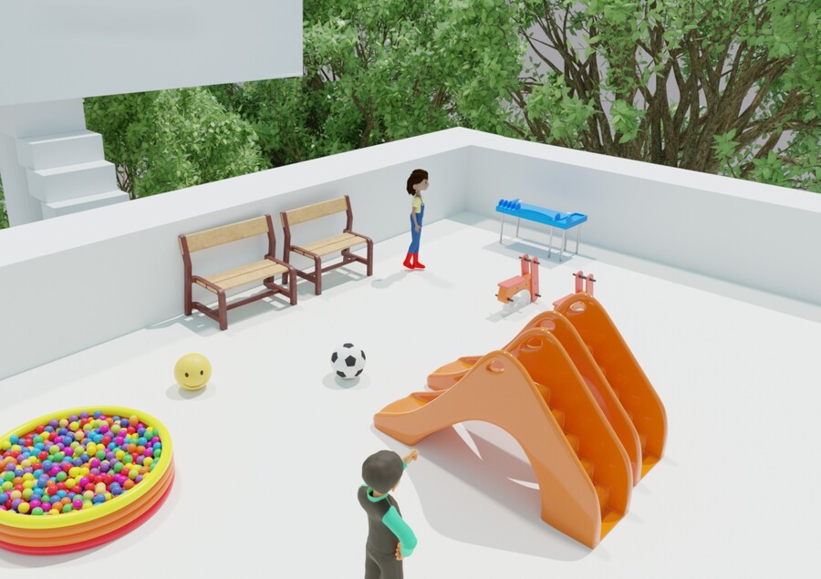
CASE 03 / EDITORIAL & SPATIAL WAYFINDINGGuidebook to the Museum of Lost ThingsRole: 3D Architectural Concept, Editorial Design, Infographics & Navigation SystemProblem & Spatial Idea: The museum is not just a display of forgotten jewelry, antique artifacts, and toys—it is a meeting place where visitors post notices and uncover human stories behind every object. I envisioned the museum as a 3D cluster of white cubic pavilions suspended in nature and linked by sky-bridges and staircases.
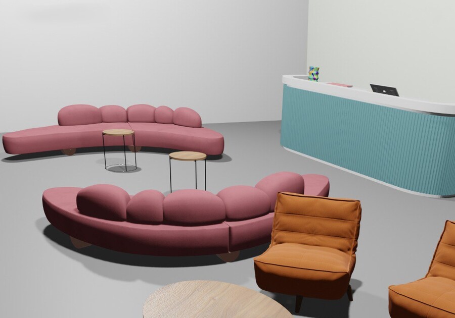
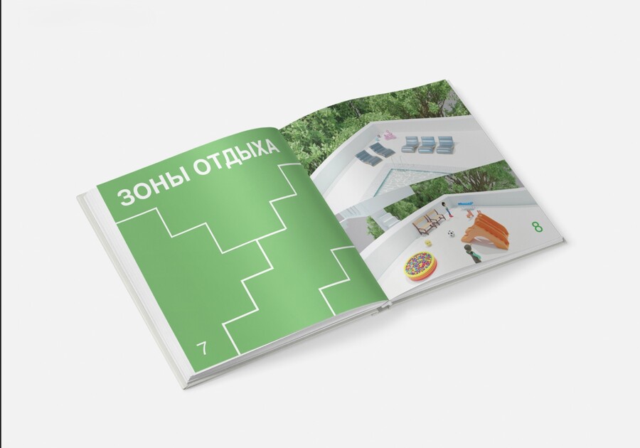
CASE 03 / EDITORIAL ARCHITECTURE & RESULTA Continuous Staircase Line That Guides Every PageThe Solution & Result: To prevent visitors from getting lost inside this multi-level complex, I designed a structured square guidebook. A thin white step-line graphic runs continuously across the spreads, connecting color-coded chapters: Concept, Rest Zones, Floor Plans, Staff, Hall of Money, Book Hall, and Music Hall—supported by custom geometric pictograms and 3D interior renders.
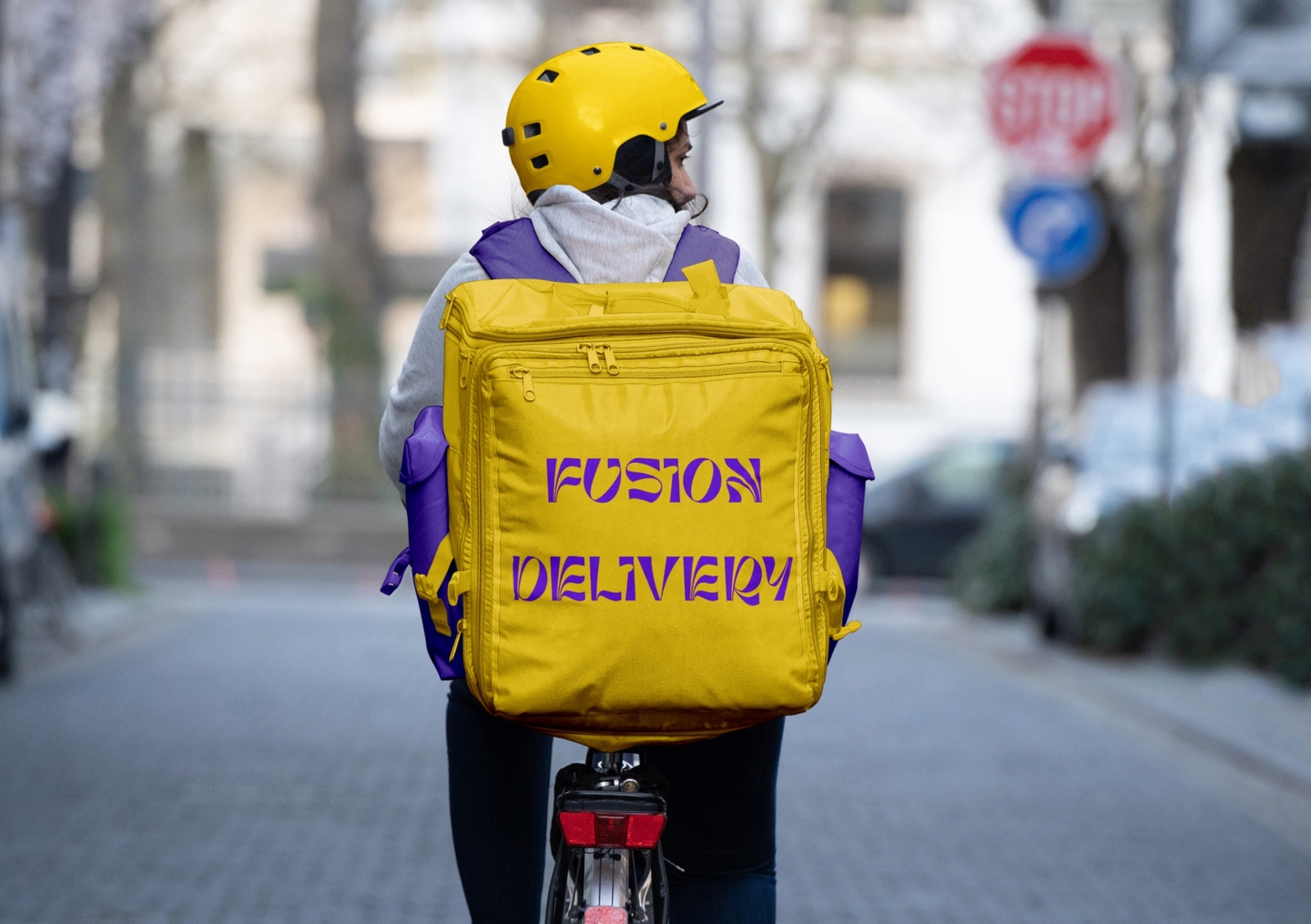
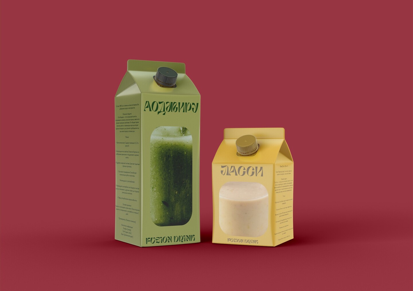
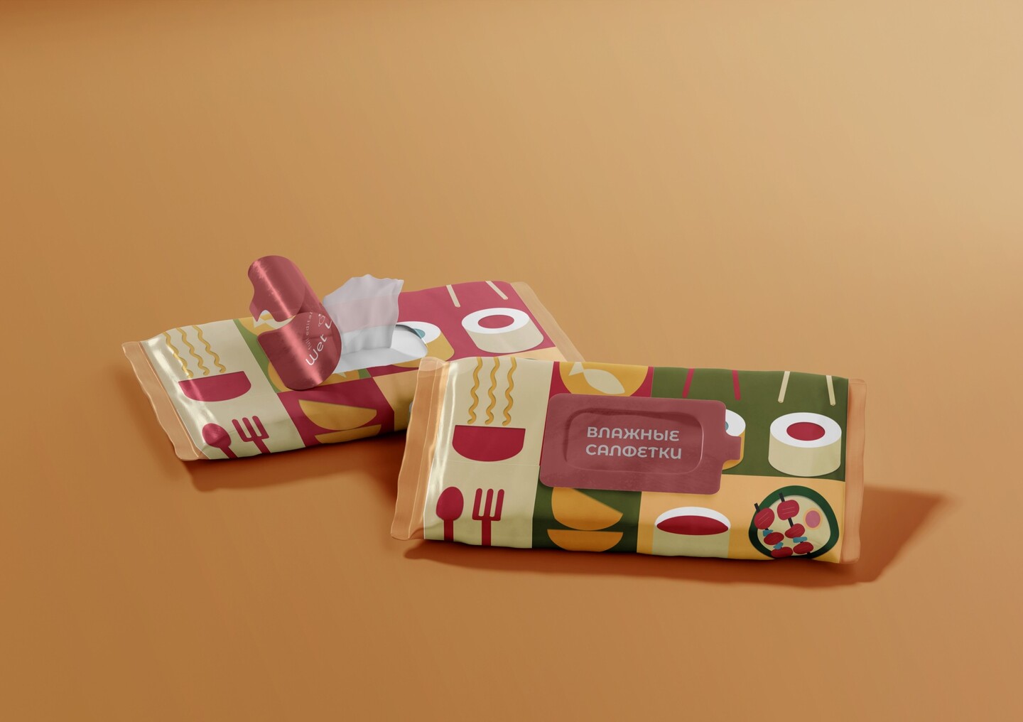
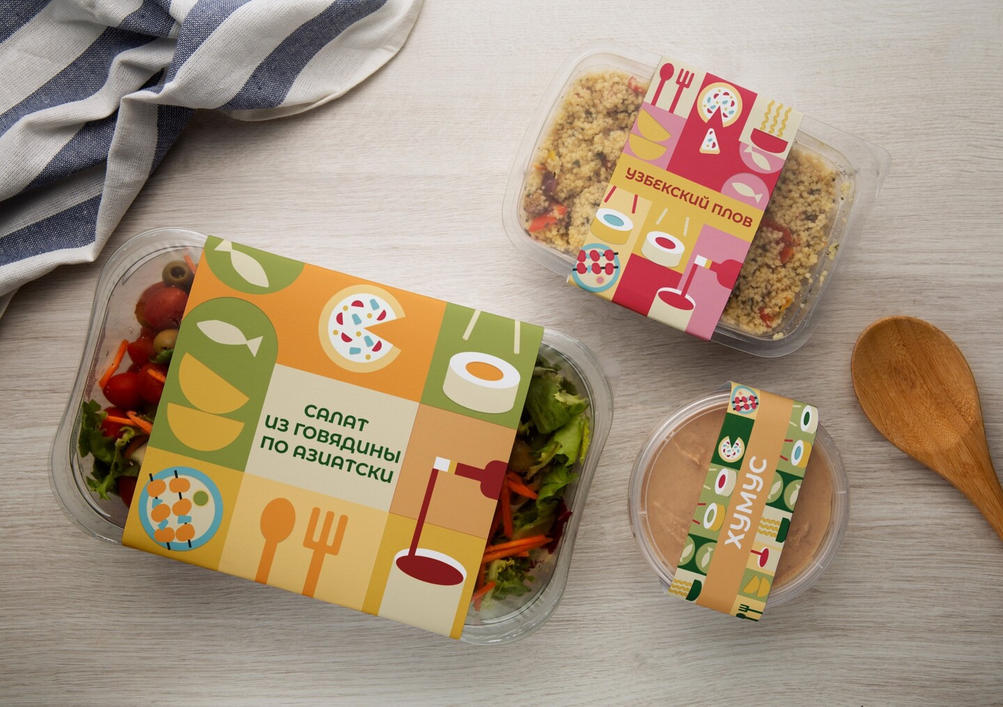
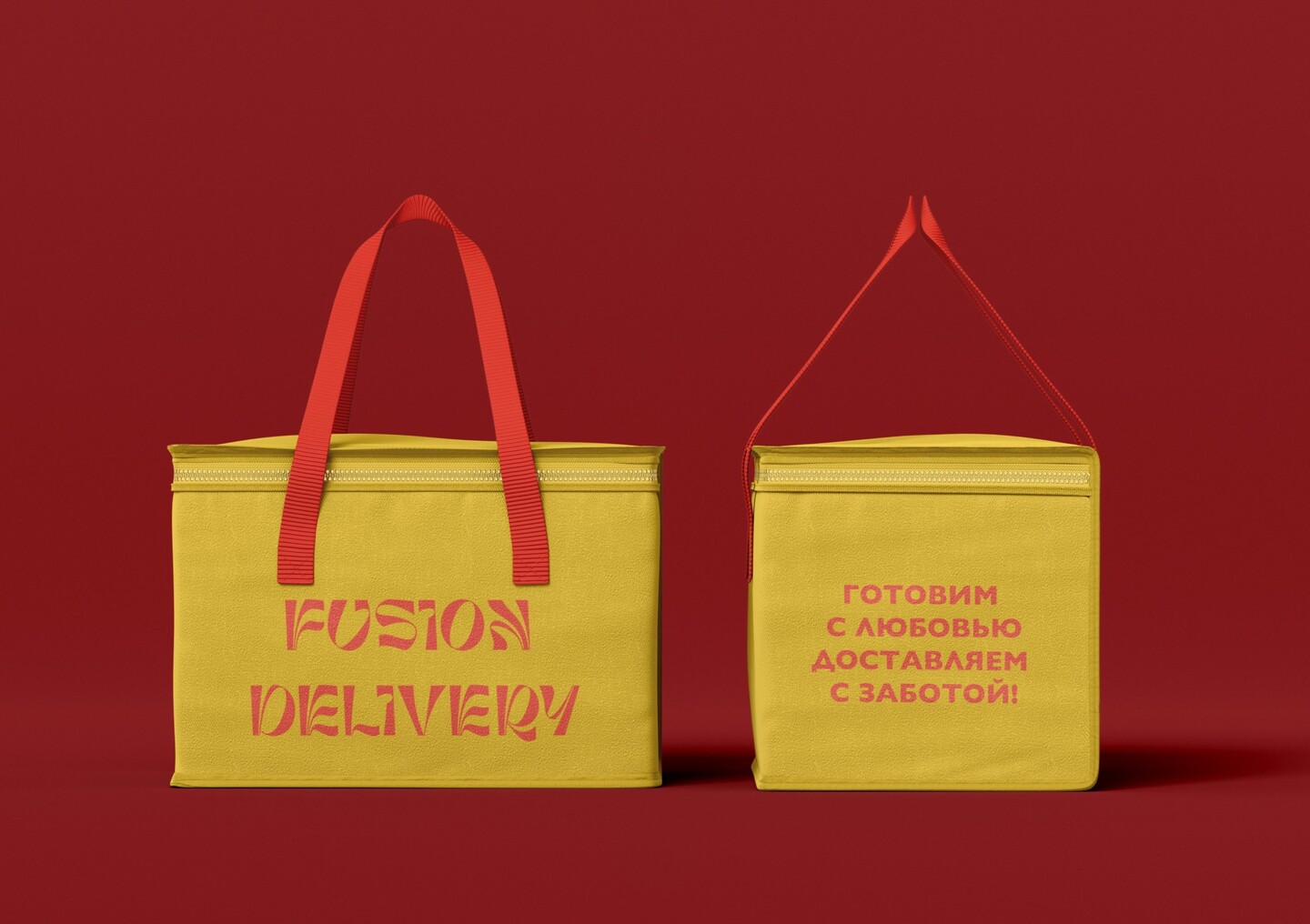
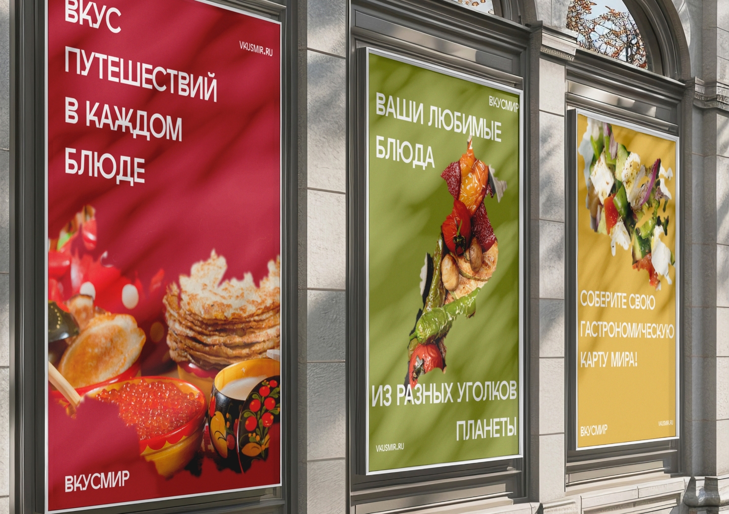
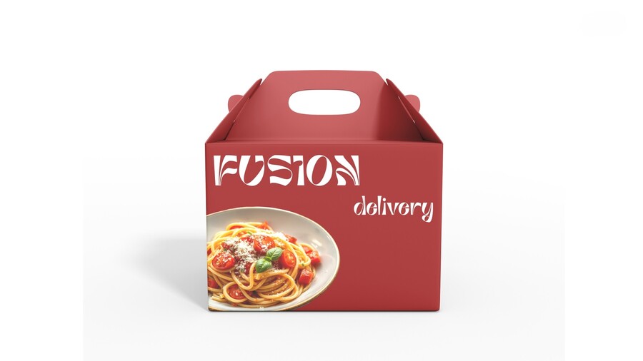
CASE 04 / FMCG BRANDING & PACKAGINGFUSION — World Cuisines To GoRole: Brand Strategy, Archetypes, Visual Identity, Eco-Packaging SystemMarket Problem & Mission: Busy professionals, students, and active city dwellers want diverse, restaurant-quality world cuisines without wasting hours cooking. FUSION makes healthy, balanced global meals accessible every day—saving clients’ time while caring for their well-being through 5 core pillars: Convenience, Quality, Ecology, Diversity, and Speed.
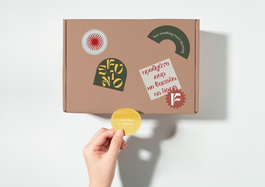
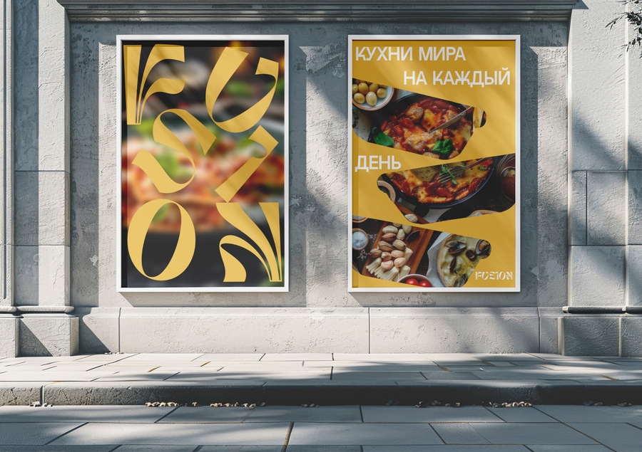
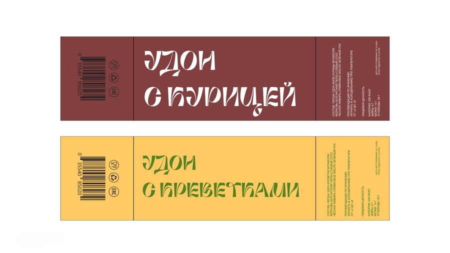
CASE 04 / VISUAL SYSTEM & PACKAGING RESULTBrand DNA: Built on a 50/50 balance of the Realist (trust, safety, service) and Caregiver (warmth, simplicity, care) archetypes.Visual Solution & Result: I paired the expressive, culinary curves of the Ambidexter display typeface with clean Helvetica nutrition grids and an appetite-driven palette of olive green, saffron yellow, and deep terracotta. From Salmon Poke bowls and Tom Yum trays to octagonal Udon wok boxes, the recyclable kraft sleeves create instant shelf recognition.