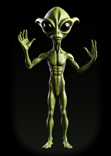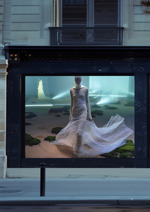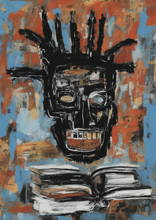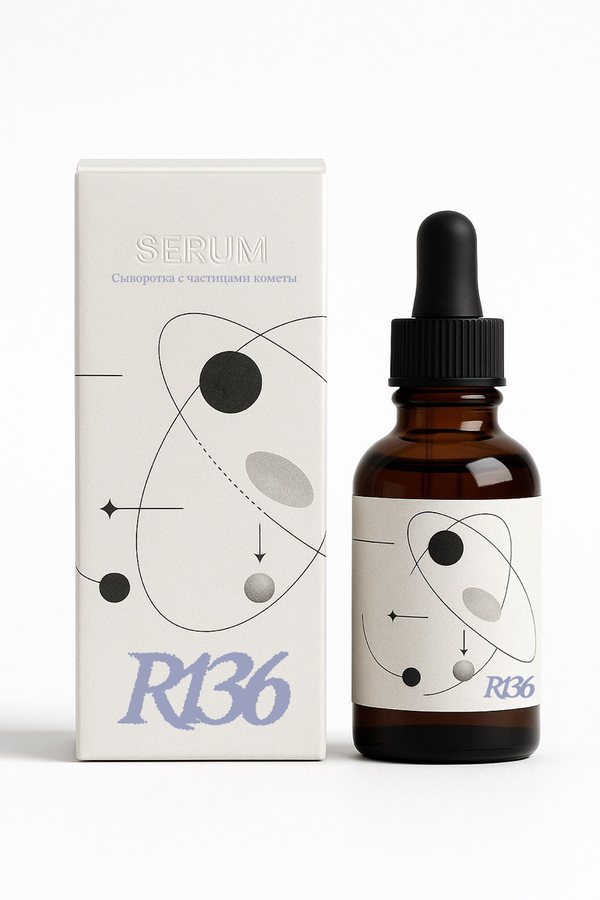
R136 is a cosmetic brand that produces goods from materials mined from space—for example, powder made from lunar dust or lipstick using pigments from the planet Mars. The brand is named after a star cluster that contains the brightest star in the universe, R136a1. The company’s cosmetics will highlight the beauty of its customers and reveal their most radiant features. R136 primarily creates dark and glittering cosmetics, taking inspiration from the visuals of space. This project is the identity design for this company.
I manually created the project’s visuals two years ago. Nevertheless, any brand that wants to remain relevant requires continuous monitoring of trends and feedback from its clients. To reimagine the company, a rebrand will be executed using artificial intelligence.
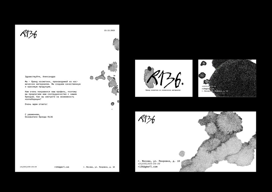
New Identity
I was satisfied with the project’s naming, so I immediately moved on to developing the logo. For this, I used the Sora neural network.
The prompt I used was:
Subject & Style: Create a vector-based, text-only logo for a company named «R136». Typography: · The text must be «R136», written in a bold, italicized font. · The font style should be uneven, messy, and slightly grungy. · Make the text less legible by artistically connecting some of the letters together (e.g., the leg of the «R» might flow into the «1», or the «3» into the «6»). · The entire logo must be solid black on a pure white background. Texture & Effect: · The edges of the letters should not be sharp. Instead, they should appear slightly blurred and eroded. · Create this blurred, erasing effect by constructing the outlines of the letters from large, coarse halftone dots (like a vintage newspaper print but with much larger dots). The dots should be most dense in the center of the strokes and fade out at the edges, creating the illusion that the logo is made of particles and is slightly dissolving or worn away. Technical Specifications: · Format: Vector (emphasize clean paths built from the dot pattern, not a raster image). · Color: Strictly monochrome—only black for the logo and pure white for the background. · Aspect: High-contrast. ---> Avoid: Do not add any additional elements, icons, shapes, or colors. Focus solely on the stylized text as described.
After generating the logo, I converted it to a vector through image tracing in Adobe Illustrator.
Next, I developed a unified graphic style for use in the brand identity. To achieve this, Sora generated several images for me. I achieved the desired visuals through the following prompt:
Minimalist color palette and abstract schematic graphic for a cosmic cosmetics brand. The graphic is in the style of a vintage textbook or scientific diagram, featuring subtle schematic drawings of planets, orbits, dotted trajectories, and labels with arrows. The design should use a limited color scheme: deep black, clean white, with accents of iridescent nebula purple and metallic silver. The overall mood is mysterious, luxurious, and scientific. Style: retro-futurism, vintage schematics, minimalism, abstract cosmic art. --ar 16:9 --style raw. Should be suitable for the logo (attached image 1), but should not incorporate it. Do not use visible text; it should be minimalistic, abstract, and should not contain obvious associations with astronomy. Distressed effect or Worn effect. Nuanced color composition. Predominantly light or Mostly light. Blur effect. Vintage diagrams details
Next, I used Adobe Color to select a color palette from one of the generated images for the project’s graphics.
I asked Sora to select a font for the logo using this prompt:
Design a company logo. Below the logo, place a neat and elegant inscription that says «cosmetics brand». The typography for the entire design should be minimalist yet inspired by the elegant, serif fonts found in vintage magazines from the mid-20th century. The mood is sophisticated and retro.
I found a similar font using the WhatFontIs service.
This is how the final identity formula was formed.
Carriers
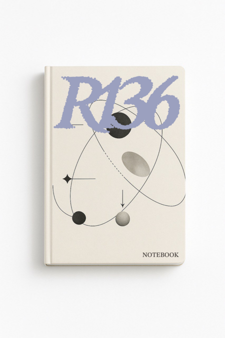
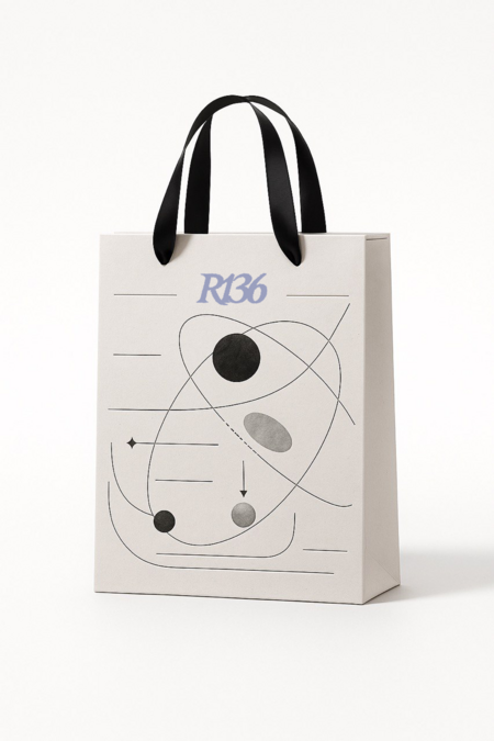
To illustrate how the identity system functions, several examples of its application across various media have been created. I developed the mockups simultaneously with the graphics using Sora and Adobe Photoshop, adding the logo and text blocks as needed.
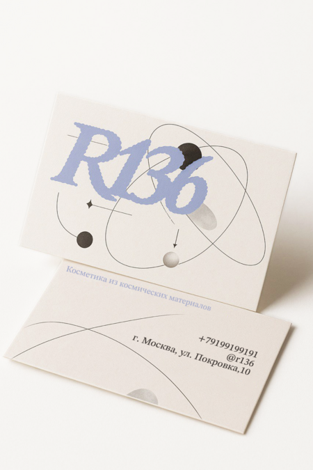
Business Card Prompt:
A professional product photo of a double-sided business card mockup on a white minimalist background. The business card is placed at a slight angle to show both sides, with soft, natural shadows falling behind it. The card should be horizontal. One side features the first attached photo, and the other side features the second attached photo. The image is hyper-realistic, photorealistic, shot with a professional DSLR camera, 100 mm macro lens, sharp focus, studio lighting, clean composition. Style: corporate, elegant. Notebook Prompt:
A professional product photo of a sleek A5 notebook mockup on a pure white background. The notebook cover has graphics similar to the attached photo. Change the composition slightly, but maintain the same style. The notebook is closed and placed at a subtle angle. Soft, natural shadows fall underneath, studio lighting, hyper-realistic, photorealistic, shot with a professional DSLR camera, sharp focus. The cover has a matte texture with a debossed title.
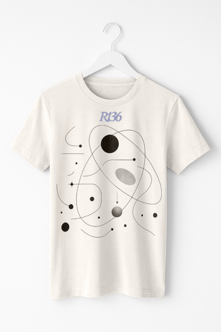
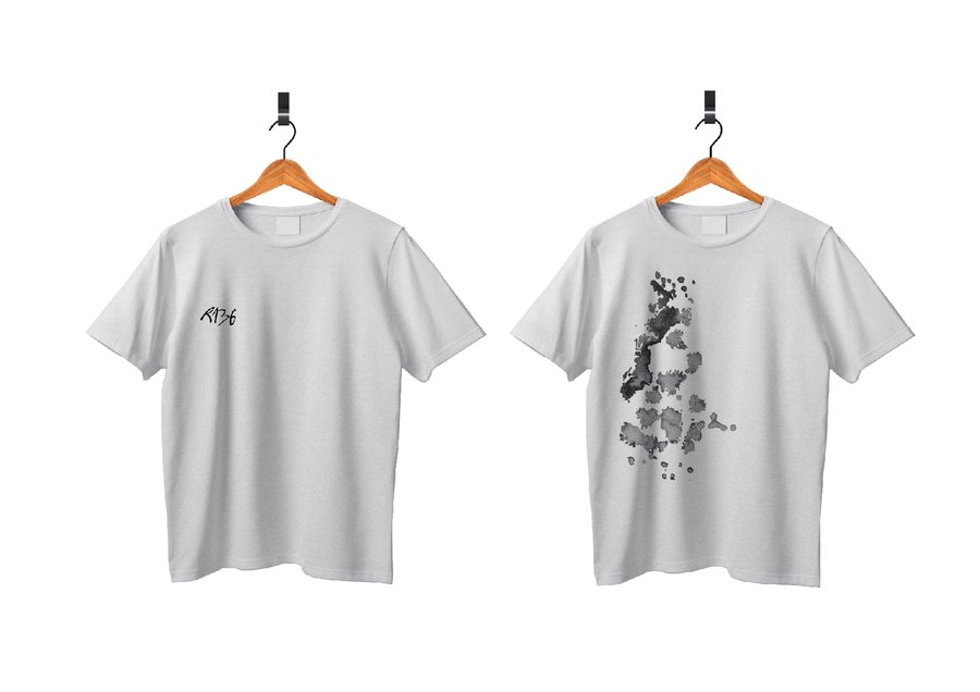
T-shirt Prompt:
Professional product photo of a t-shirt mockup on a pure white background. The t-shirt design should feature graphics similar to the attached photo. Adjust the composition slightly while maintaining the same style. Incorporate additional lines and figures. The t-shirt is hanging on a white hanger. Soft, natural shadows fall underneath; studio lighting, hyper-realistic, photorealistic, shot with a professional DSLR camera, sharp focus. The cover should have a matte texture with a debossed title.
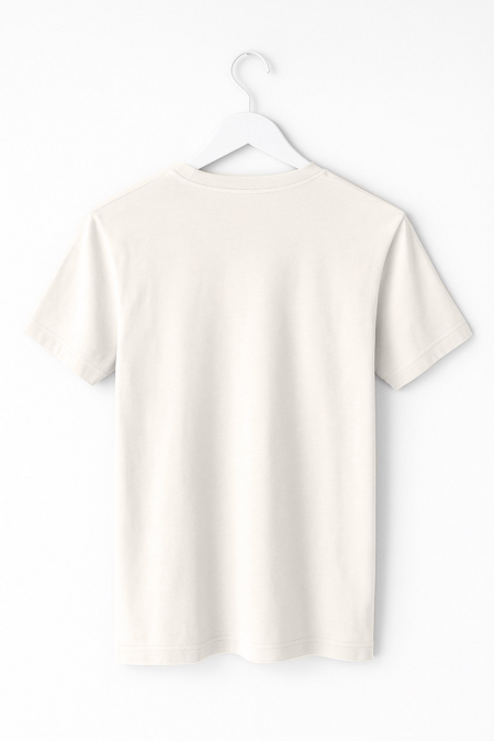
Create the same t-shirt on a hanger with the same lighting and composition, but show the back of the t-shirt with no prints.
Prompt for the package:
Professional product photo of a branding paper bag with ribbon handles mockup on a pure white background. The bag cover features graphics similar to those in the attached photo. Adjust the composition slightly, but maintain the same style. Add more subtle line work. Soft, natural shadows fall underneath, studio lighting, hyper-realistic, photorealistic, shot with a professional DSLR camera, sharp focus. The cover has a matte texture with a debossed title.
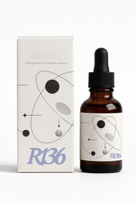
Prompt for the serum:
Professional product photo of a facial serum packaging mockup on a pure white background. Bottle and box nearly identical. The box and bottle designs should be slightly different, but both should feature graphics similar to those in the attached photo. Adjust the composition slightly, but maintain the same style. Soft, natural shadows fall underneath, studio lighting, hyper-realistic, photorealistic, shot with a professional DSLR camera, sharp focus. The cover has a matte texture with a debossed title.
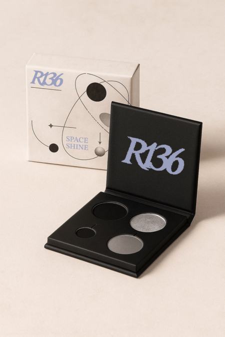
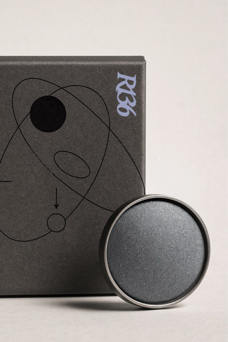
Shadow Prompt:
Professional product photo of an eyeshadow packaging mockup. It should feature a box of shadows along with the shadows themselves. Soft, natural shadows fall underneath, studio lighting, hyper-realistic, photorealistic, shot with a professional DSLR camera, sharp focus. The cover should have a matte texture—the graphics on the package are for a cosmetic brand that creates its products from cosmic materials, and they should match the style of the attached photo. Do not include any text.
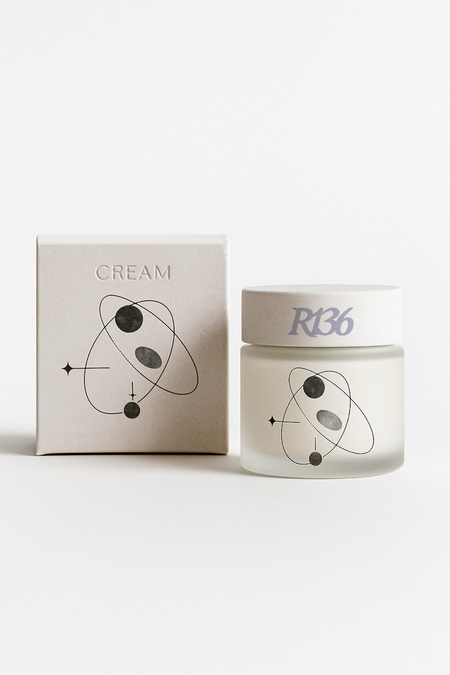
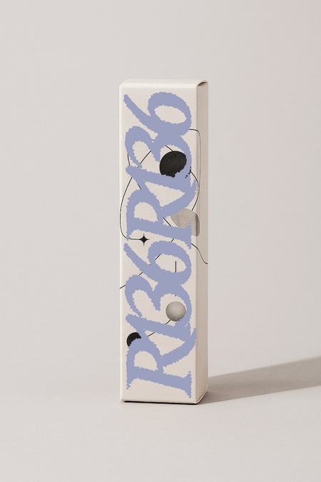
Cream Prompt:
Professional product photo of a facial cream packaging mockup on a pure white background. The cream jar and box are almost complete. The box and jar covers should be slightly different in design, but both should feature similar graphics to the attached photo. Change the composition slightly, but maintain the same style. Soft, natural shadows fall underneath, studio lighting, hyper-realistic, photorealistic, shot with a professional DSLR camera, sharp focus. The cover has a matte texture with a debossed title.